Today's post continues our examination of non-transformative and transformative inks as they were used on the printings of the 1967-1973 Centennial Issue. Specifically, we will look at the 5c through 7c values.
5c Blue - Atlantic Fishing Village
The vast majority of the printings of this stamp are in a transformative ink that comes very close to being black under UV, while a smaller portion of the stamps are printed in non-transformative inks that either do not appear significantly different under the lamp, or they merely appear deeper, without losing the essential character of their original colour.
Non-Transformative Inks
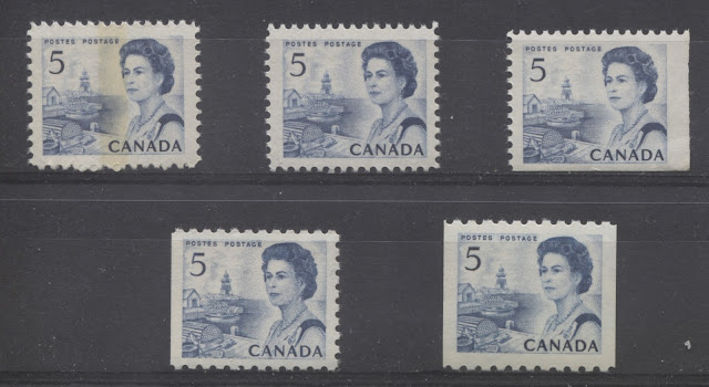
Let us start off with five stamps that are all printed in various shades of deep blue:
The first two stamps on the top row are CBN sheet stamps with PVA gum, one of which is tagged with a Winnipeg centre bar, while the upper right stamp is a CBN booklet stamp on dead paper. On the second row we have a BABN perf. 10 booklet stamp, and to the right, a CBN coil, perforated 9.5 horizontally. All of these stamps are printed in various shades of blue, with the stamps on the top row being the darkest, and closest to violet blue, and the two stamps on the bottom being bright blue.
Under the UV lamp, those same five stamps look like this:
If you look carefully at this picture and compare to the scan, you can see that all of these stamps still appear to be printed in blue ink, although the ink of the top three stamps now appears darker than it did before. The stamps on the bottom row, especially the perf. 10 BABN booklet stamp do not appear all that much different under UV from how they appear in normal light. This picture does also do a good job of showing the stark differences between the papers, all of which look extremely similar in normal light, but nothing alike under UV.
The non-transformative inks seem to occur mainly on the PVA gum stamps, which is the opposite of what we typically find on the other values, and on most of the booklet stamps and some of the coils.
Transformative Inks
Now, let's take a look at seven more stamps:
With the exception of the coil stamps, all of the 6c orange stamps were printed by the BABN. The inks are always transformative, with one exception: the commonly known fluorescent ink printings.
Non-Transformative Fluorescent Ink
Let's start off looking at an example of the fluorescent orange ink, from one of the 25c booklet panes:
The basic shade of this stamp in normal light is that of a bright orange-red, which is to say, orange that has a touch of red. It is quite a bright colour under normal light.
Now, let's take a look at it under UV:
Transformative Inks
Now, let't take a look at eight stamps commonly found of this value:
With the exception of the bottom right tagged perf. 12.5 x 12 sheet stamp, which is a dull red-orange, all the other shades are shades of orange-red and are quite bright. On the top row we have a perf. 10 booklet stamp on hibrite paper, with type 1 dex gum, two coil stamps with type 2 dex gum on dull fluorescent paper and a perf. 10 precancel on dull fluorescent paper with type 1 dex gum. The coils are shades of almost pure, bright orange, that do not have the reddish undertone that is present in the other stamps. On the bottom row we have two sheet stamps, one tagged and the other untagged. The untagged stamp has type 1 dex gum, while the tagged stamp has type 3 dex gum. Then we have two perf. 12.5 x 12 sheet stamps, one untagged and the other tagged. Both are on dull fluorescent paper, with type 3 dex gum.
Lets now take a look at the stamps under UV light:
The stamp on hibrite paper appears now to have been printed from black ink rather than orange ink. The others still appear orange, but it is no longer the bright orange that we see in normal light. It is actually quite close to a very deep brownish orange, and the bottom right stamp is almost brown. So because the colour has lost the brightness that it had in normal light, I have classified all of these inks as transformative in nature.
6c Black - Transportation
As one might expect, due to the nature of the colour, this is the only stamp from the series that I know of, that is printed entirely from non-transformative ink, which in nearly every instance appears almost identical under UV to how it appears in normal light.
Let's take a look at seven stamps, which comprise several of the BABN printings and the CBN coil:
Now, let's take a look at two of the CBN sheet stamps that were printed using the revised die:
Most collectors who have experience with this value notice after a while that there are two basic shades: a deep emerald green, and a myrtle green which is quite deep and dull. Those stamps printed in the deeper, duller shade, are printed in a non-transformative ink, while those printed in the deep emerald, tend to be printed in a transformative ink that tends to look black under UV.
Non-Transformative Inks
Lets take a look now at five of the stamps printed in the deeper, duller myrtle green:
5c Blue - Atlantic Fishing Village
The vast majority of the printings of this stamp are in a transformative ink that comes very close to being black under UV, while a smaller portion of the stamps are printed in non-transformative inks that either do not appear significantly different under the lamp, or they merely appear deeper, without losing the essential character of their original colour.
Non-Transformative Inks
Let us start off with five stamps that are all printed in various shades of deep blue:
The first two stamps on the top row are CBN sheet stamps with PVA gum, one of which is tagged with a Winnipeg centre bar, while the upper right stamp is a CBN booklet stamp on dead paper. On the second row we have a BABN perf. 10 booklet stamp, and to the right, a CBN coil, perforated 9.5 horizontally. All of these stamps are printed in various shades of blue, with the stamps on the top row being the darkest, and closest to violet blue, and the two stamps on the bottom being bright blue.
Under the UV lamp, those same five stamps look like this:
If you look carefully at this picture and compare to the scan, you can see that all of these stamps still appear to be printed in blue ink, although the ink of the top three stamps now appears darker than it did before. The stamps on the bottom row, especially the perf. 10 BABN booklet stamp do not appear all that much different under UV from how they appear in normal light. This picture does also do a good job of showing the stark differences between the papers, all of which look extremely similar in normal light, but nothing alike under UV.
The non-transformative inks seem to occur mainly on the PVA gum stamps, which is the opposite of what we typically find on the other values, and on most of the booklet stamps and some of the coils.
Transformative Inks
Now, let's take a look at seven more stamps:
These stamps are all dex gum printings showing nearly the full range of gums, and all on plain, dull fluorescent paper, except for the bottom right precancelled stamp, which is on highbrite paper. Five of the stamps are sheet stamps, and two are coils, all printed by CBN. One sheet stamp is tagged with a Winnipeg centre bar. Again, these are all printed in various shades of blue, with the bottom centre stamp being duller, the coils all being a brighter blue and the others being deeper blue.
Let's look at them under UV:
On these stamps, the ink has turned black or very close to black on all but the coil stamp at the top right. The top right coil stamp is still blue, but is is now a very dull blue and has lost all the brightness that it had in normal light. The other stamps are so close to black that they have lost their essentially blue appearance that they had in normal light. Therefore, I have classified these as being printed with transformative ink.
The transformative inks seem to predominate the CBN dex gum stamps.
6c Orange - TransportationWith the exception of the coil stamps, all of the 6c orange stamps were printed by the BABN. The inks are always transformative, with one exception: the commonly known fluorescent ink printings.
Non-Transformative Fluorescent Ink
Let's start off looking at an example of the fluorescent orange ink, from one of the 25c booklet panes:
The basic shade of this stamp in normal light is that of a bright orange-red, which is to say, orange that has a touch of red. It is quite a bright colour under normal light.
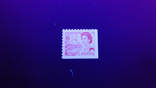
Now, let's take a look at it under UV:
As you can see, the colour appears a little deeper, but it is still a shade of orange-red, and it is still very bright. The introduction of UV light has not changed the colour significantly. This is what is commonly known to collectors as the fluorescent orange ink. It is found on a small portion of the perf. 10 sheet stamps, and the booklet stamps from the 25c booklets. It is known in two different shades under UV: one being the bright orange red that you see here, and another in a deeper red-orange.
Transformative Inks
Now, let't take a look at eight stamps commonly found of this value:
With the exception of the bottom right tagged perf. 12.5 x 12 sheet stamp, which is a dull red-orange, all the other shades are shades of orange-red and are quite bright. On the top row we have a perf. 10 booklet stamp on hibrite paper, with type 1 dex gum, two coil stamps with type 2 dex gum on dull fluorescent paper and a perf. 10 precancel on dull fluorescent paper with type 1 dex gum. The coils are shades of almost pure, bright orange, that do not have the reddish undertone that is present in the other stamps. On the bottom row we have two sheet stamps, one tagged and the other untagged. The untagged stamp has type 1 dex gum, while the tagged stamp has type 3 dex gum. Then we have two perf. 12.5 x 12 sheet stamps, one untagged and the other tagged. Both are on dull fluorescent paper, with type 3 dex gum.
Lets now take a look at the stamps under UV light:
The stamp on hibrite paper appears now to have been printed from black ink rather than orange ink. The others still appear orange, but it is no longer the bright orange that we see in normal light. It is actually quite close to a very deep brownish orange, and the bottom right stamp is almost brown. So because the colour has lost the brightness that it had in normal light, I have classified all of these inks as transformative in nature.
6c Black - Transportation
As one might expect, due to the nature of the colour, this is the only stamp from the series that I know of, that is printed entirely from non-transformative ink, which in nearly every instance appears almost identical under UV to how it appears in normal light.
Let's take a look at seven stamps, which comprise several of the BABN printings and the CBN coil:
All of these stamps are printed in a shade of black that contains a hint of silver, with the top right and bottom left stamps being just a bit more intense. On the top row we have three die 1 sheet stamps, with the first being on dull fluorescent paper with type 2 dex gum, the second being on low fluorescent paper with type 1 dex gum, and the third being Winnipeg tagged, on dull fluorescent paper and type 1 dex gum. On the top right, we have a die 2 sheet stamp on dull fluorescent paper with type 2 dex gum.
On the bottom row, we have die 2 with a Winnipeg centre bar tag, dull fluorescent paper and type 1 dex gum. The there is a die 1 booklet stamp, perf 10 on dull fluorescent flecked paper, with type 2 dex gum, and finally a CBN coil on hibrite paper with type 2 dex gum.
Let's take a look at them all under UV:
While the papers look slightly different, the colour of the inks do not appear significantly different under UV light as compared to normal light.Now, let's take a look at two of the CBN sheet stamps that were printed using the revised die:
On the left, we have a general tagged sheet stamp on smooth, low fluorescent flecked paper, with matte PVA gum, while on the right we have a precanceled sheet stamp, printed on horizontally ribbed low fluorescent flecked paper, also with matte PVA gum. Both of these stamps are printed in a deep grey-black in which the grey undertone is quite pronounced.
Now, let's look at them under UV:
In reality, the greyish undertone does become every so slightly more pronounced under UV, but the colour does not appear significantly different from how it appears under normal light.
7c Myrtle Green - TransportationMost collectors who have experience with this value notice after a while that there are two basic shades: a deep emerald green, and a myrtle green which is quite deep and dull. Those stamps printed in the deeper, duller shade, are printed in a non-transformative ink, while those printed in the deep emerald, tend to be printed in a transformative ink that tends to look black under UV.
Non-Transformative Inks
Lets take a look now at five of the stamps printed in the deeper, duller myrtle green:
On the top row we have three sheet stamps and the booklet stamp. All four of these stamps have type 1 dex gum, and are printed on dull fluorescent paper. The second stamp from the left is Winnipeg tagged. The stamp on the bottom row is also on dull fluorescent paper and has type 3 dex gum. All of these are clearly green, but the shade is deep, dull and lacks the blue undertone and brightness that the emerald green has.
Here is how they appear under UV:
Although they look blackish in this picture, in reality, they are actually just much darker shades of green. The colour though is still the same fundamental deep dull green here that appears in normal light, which is why I classify this ink as non-transformative.
The non-transformative ink seems to have been used for all BABN printings with dex gum.
Transformative Inks
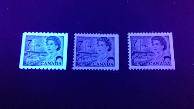
Let's take a look at two booklet stamps with PVA gum, and the CBN coil stamp on hibrite paper:
The coil stamp is printed in a shade that is closest to pure myrtle green, being neither overly bluish, nor blackish. The middle stamp is both deeper and duller, while the right stamp is more toward the deep emerald end of the shade range. Both booklet stamps have satin PVA gum, but the middle stamp is printed on dull fluorescent paper, while the right stamp is on low fluorescent paper.
However, under UV light, the colours are completely different:
The ink colour of the coil is almost pure black, while the two booklet stamps are a very deep blackish green. I have classified these as transformative because the colour has completely lost the brightness and the bluish tone.
So it would appear that the transformative inks are found on the coils and the booklet stamps that were printed with PVA gum.
This brings me to the end of my post for this week, and my discussion of the inks on these two stamps. I may not have a post next week, as I will be taking a break with family for the first two weeks of October. However, I will try to complete the next post nonetheless. However, if I am unable t publish one, I would encourage you to go back and review all of the posts on this issue thus far to help you solidify your knowledge. My next post will look at the 8c Parliament, and the first three Group of Seven paintings: the 8c through 15c.


