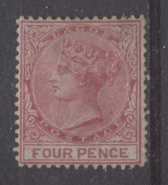
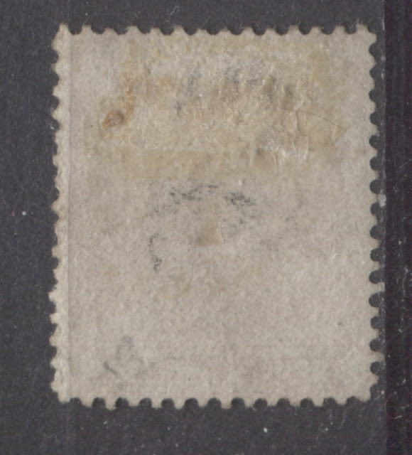
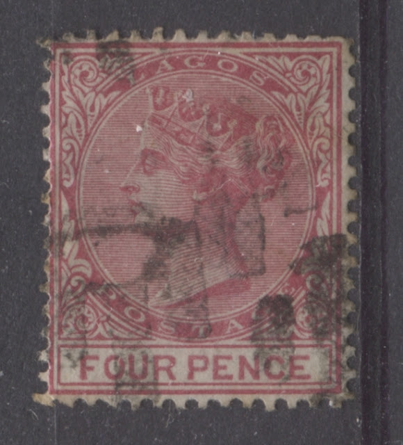
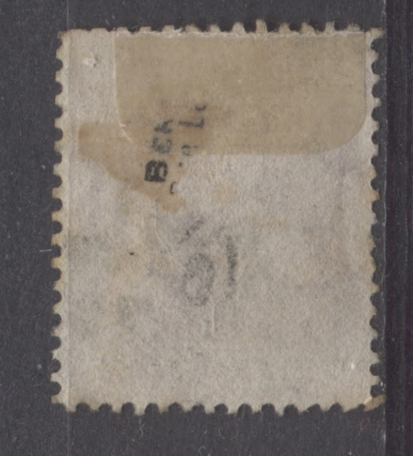
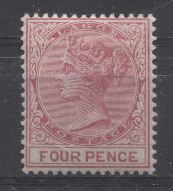
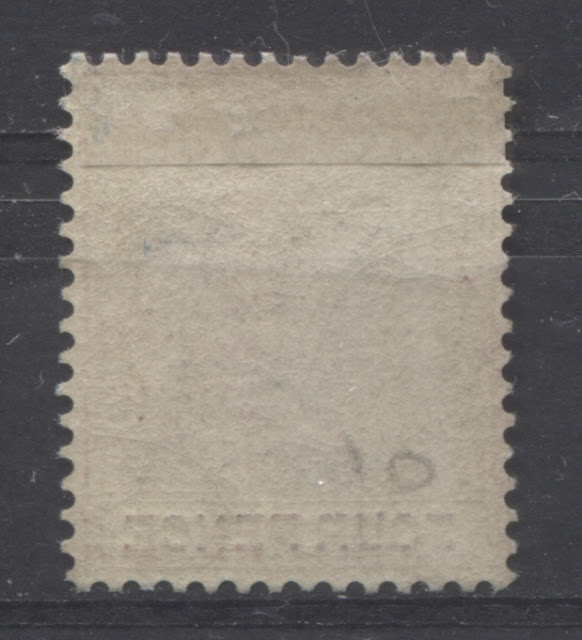
Overview
Today's post will deal with the second most complicated value in this second Queen Victoria series, the 4d rose. There were six printings made between 1876 and 1880, which totaled 959 sheets of 60 stamps (57,540) as follows:
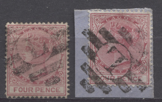
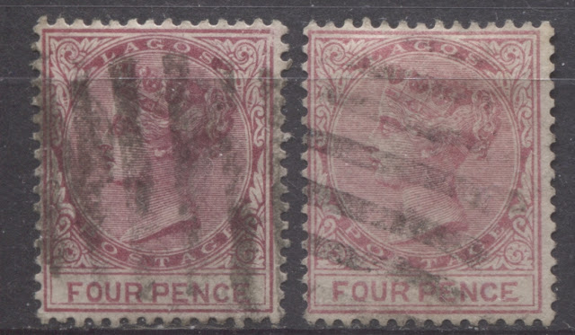
The stamp on the left is the most bluish of the three. The middle stamp is the same general tone as the one on the left, while the stamp on the right is less bluish. Most, but not all used examples in my stock bear the Lagos diamond grid cancel. I do have one example, shown at right, that is cancelled with the 9-bar oval barred obliterator.
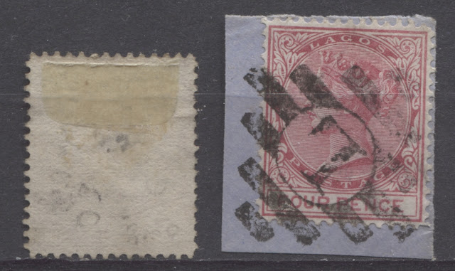
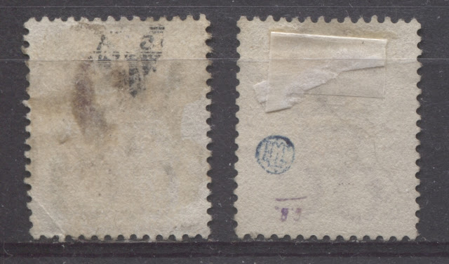
Let's take a look at the backs:
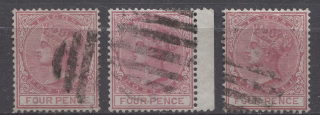
You have to look carefully, but if you look at these stamps long enough you can see that the words "four pence" are a lighter rose than the rest of the stamp.
Here you can see some slight variations in the shade, but all of them are very similar. They are all comb perforated, and the duty plate and head plate colours are the same.
Today's post will deal with the second most complicated value in this second Queen Victoria series, the 4d rose. There were six printings made between 1876 and 1880, which totaled 959 sheets of 60 stamps (57,540) as follows:
- May 9, 1876 - 104 sheets or 6,240 stamps.
- June 12, 1877 - 203 sheets, or 12,180 stamps.
- August 28, 1878 - 250 sheets, or 15,000 stamps.
- July 23, 1879 - 102 sheets, or 6,120 stamps.
- November 26, 1879 - 100 sheets, or 6,000 stamps.
- November 18, 1880 - 200 sheets, or 12,000 stamps.
The above figures illustrate that while the second, third and last printings, are about equally scarce, the first, fourth and fifth printings are at least twice as scarce as all the others, and in mint condition, should be as scarce as the one shilling, of which 5.760 stamps were issued.
One difficulty with this stamp is that the number of shade combinations for the head plate, and the duty plate, is greater than six, so some printings had more than one shade. It seems safe to assume that the printings that came in more than one shade, most likely are also those that had the greater numbers of stamps, i.e. the second, third and sixth printings. Generally speaking though, the overall tone of the ink should be more or less the same within a printing, with the main difference being the density or intensity of the printing ink. There are four main, basic colours for this stamp:
- Burgundy - a deep wine red. It has a slightly bluish undertone.
- Rose-carmine - a bluish rose.
- Carmine-rose - a bluish pinky red. Rose predominates over carmine.
- Rose - a pink, with no bluish or carmine undertone.
On some printings, the head plate and duty plate colours are matched, which suggests that the stamps were printed in a single operation from one batch of ink. Others have different colours for the head and duty plates, which suggests that they were printed in two different operations, from separate batches of ink. In those instances, the majority of the design was printed by the head plate first, and the words of value, were printed afterwards using the duty plate.
This value was the only one in the series to exist with the watermark sideways. Ince's work does not definitively state which of the six printings these stamps are from. However, all the examples I have seen are line perforated, which would suggest that they are from the first four or five printings, as the sixth printing for sure comes only comb perforated. However, Ince does note that the stamps of other colonies that were produced with a sideways watermark and the perforation 14, were all produced between 1876 and 1880, so the dates are of limited help unfortunately. He has hypothesized that these were all the work of a single guillotine operator (the individual who cut the watermarked paper into sheets), which the dates would seem to support.
Cancellations will be utilized to help classify the various printings. My expectation is that the first three printings should be cancelled mostly with the Lagos diamond barred grid killer, while the last three, should be found primarily with the barred oval grid cancellation.
First Printing - Dispatched May 9, 1876
I believe that the stamps from this printing are watermarked upright and sideways. The head plate and duty plate colours are the same, and the basic shade is a deep carmine-rose. All of the used copies of the sideways watermark that I have seen are cancelled with the Lagos diamond barred grid, which suggests that they must be from one of the first three printings. I have identified two basic shade groups of these stamps, and the deep carmine-rose is the scarcer of the two. Given that the first printing is twice as scarce as the second, I have concluded that the deep carmine rose is the first printing.
The shade exhibits some variation in intensity as well as the amount of carmine in the shade relative to rose. However, none of the shades are distinctly bluish.
The scans below show the front and back of an unused example with sideways watermark:
This looks much more bluish than it actually is in real life. Hopefully though you will see that it is much closer to carmine-rose than any of the other shades, when you look at the scans of the other printings. Note how the colour of the words of value (duty plate) is the same as the remainder of the design (head plate). If you look carefully at the corner perforations, you can see that they are not uniform, indicating that the stamp is line perforated.
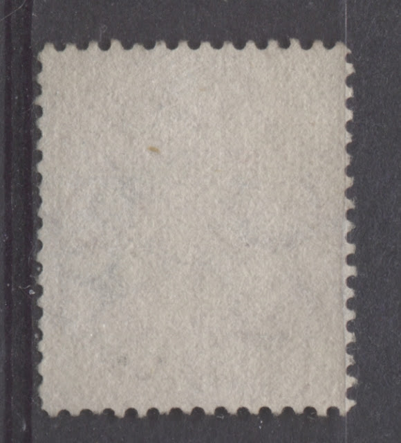
Here is the back. This example has no gum, as do most of the few mint examples in existence. because the stamp was essentially printed sideways, the direction of the paper weave his horizontal, rather than vertical. The mesh however, is not obvious from the scan above, and that is consistent with the early printings.
Let us take a look at a used example of the same stamp:
Here you can see that the shade is exactly the same as the mint stamp above. Again, the duty plate and head plate colours are the same, and the corner perforations are clearly not uniform, indicating that the stamp is line perforated.
Again, the paper is horizontal, rather than vertical wove, but the mesh is not clearly visible, nor is the watermark.
Now what about some examples showing the watermark upright? I have no mint examples, but several used examples, which match this basic shade group. Here are two of them:
As you can see, these two stamps are slightly deeper and duller compared to the stamps with sideways watermark, and in both cases, the head plate and duty plate colours match. The stamp on the right is a bit brighter than the one on the left, but these would seem to be from the same overall shade group. Note how both are line perforated, and cancelled using the Lagos diamond grid cancel.
Now, let's look at the back of the left stamp:
Again, there is no obvious mesh visible on the back, nor is the watermark clear.
Second Printing - Dispatched June 1, 1877
This printing is generally in shades of rose-carmine, rather than carmine rose, so there is generally slightly more carmine in the shade, which means that the stamps are slightly bluish in tone compared to the first printing. Like the first printing, all the used examples I have seen are cancelled with the Lagos diamond barred grid, and all the stamps are line perforated.
I do not have any other mint sideways watermarked stamps, but here are two used examples in the rose-carmine shade:
Hopefully you can see a definitely deeper and slightly more bluish tone to these two stamps, as compared to the stamps of the first printing.
Here are the back scans:
The first stamp shows no obvious horizontal mesh, but on the second stamp, you can just make out feint horizontal mesh if you look closely. In neither case is the watermark obvious.
I am fortunate to have one mint example of this printing with the upright watermark, and several used examples. Here are the front and back scans of my only mint example:
This is close to the colour of the first printing, but it is more bluish than the first. Note again that the head plate and duty plate colours are the same.
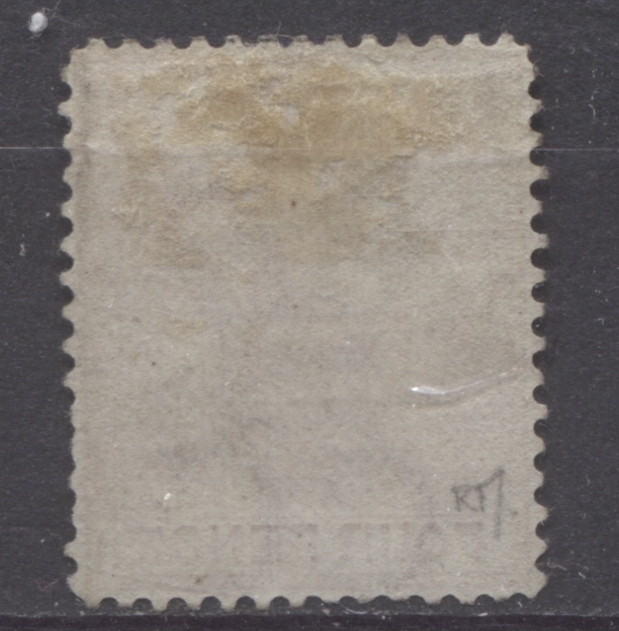
Here is the back, showing the clear, colourless gum that was used on the stamps of this period.
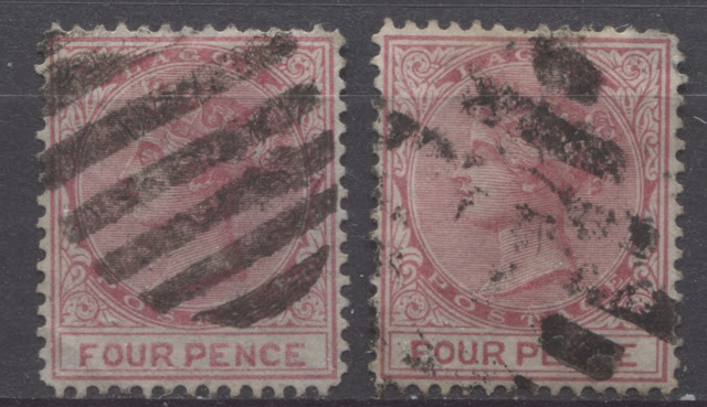
Now, for some used examples that show some of the variation that can be found in the rose-carmine shade:
The stamp on the left is the most bluish of the three. The middle stamp is the same general tone as the one on the left, while the stamp on the right is less bluish. Most, but not all used examples in my stock bear the Lagos diamond grid cancel. I do have one example, shown at right, that is cancelled with the 9-bar oval barred obliterator.
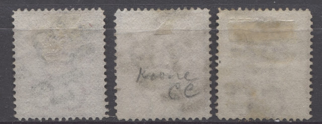
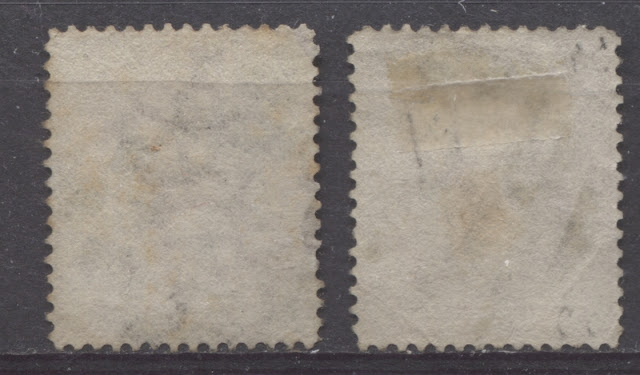
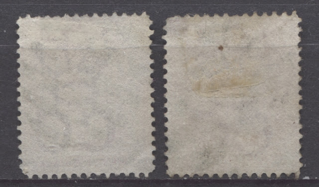
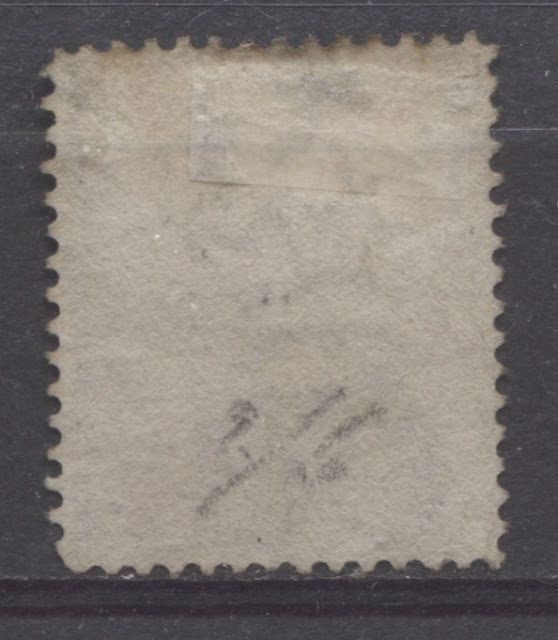
Let's take a look at the backs:
Here we can begin to see some variation in the papers, with the two on the right (which were on the left above), having the earlier smooth paper, with obscure watermark and mesh. The stamp on the left (right above) shows feint vertical mesh, and the watermark is much clearer.
Third Printing - Dispatched August 28, 1878
The colour of the stamps from this printing is a deep rose, with no bluish undertone. Occasionally, it can be found in a dusty rose, but it lacks the intensity and bluish tone of the earlier two printings. Again, the head plate and duty plate colours match. In the line perforated stamps, it is the most common of the first three printings, and it was the sheer number in my stock compared to the other printings that led me to classify it as this printing. About three quarters of the used examples that I have seen are cancelled with the Lagos diamond barred grid cancellation, while the other half have the barred oval grid cancel. I have one mint example and several used examples in three different shade groupings, which I will show below.
Here is my only mint example:
Notice how pale this colour is compared to the stamps of the earlier printings, as well as how it is not generally bluish in overall tone.
Looking at the back, we can again see the colourless gum used on these printings, the feint vertical mesh, and the feint impression of the crown-CC watermark.
Here are two used examples in the first of three shades of the deep rose:
Here we have a deep rose that is dull, but not bluish. The example on the left has the Lagos diamond barred grid cancel, while the one on the right is cancelled with the barred oval grid. Both stamps are clearly line perforated, because of the uneven corner perforations.
The backs of these two stamps show the smooth, vertical wove paper, with no visible mesh, and the watermark only barely visible.
Here are two more, in another shade variation:
These stamps are much closer to the pure deep rose in that they are not dull like the ones above, but are there is still a little bit of variation in tone, with the left stamp being slightly bluish compared to the one on the right. But it is not bluish compared to any of the earlier printings. Again, both stamps are line perforated, and both cancellation types are represented.
On these two stamps, the watermark is a little more visible, but there is no obvious mesh visible once again.
Finally, I have one stamp in a dusty rose shade, with the barred oval cancel:
Once again, you can see that the duty plate colour matches the head plate. The stamp is line perforated, and on the back, neither the watermark, nor the vertical mesh is readily visible.
Fourth Printing - Dispatched July 23, 1879
As best I can tell all the printings starting with this one are comb perforated. This is despite the fact that the other denominations printed at this time are all line perforated. I came to this conclusion because I have found three basic shade groups in the comb perforation, with two of these being equally scarce, and the last one being much more common. Given that the comb perforation equipment was acquired in 1878, it is plausible that the comb machines were used to perforate this value, and the line machines continued to be used for the 1d and 2d values that were printed at this time. All of the used examples I have seen of the next three printings, without exception, are cancelled with the barred oval grid cancel.
The basic colour of this printing is burgundy and pale burgundy. The burgundy is very distinct and completely unlike any of the other printings. Once again, the head plate and duty plate colours are the same.
I have no mint examples, and only two used stamps, one of each shade:
The stamp on the left is the burgundy, while the one on the right is pale burgundy. They are not bluish in tone, but just a very deep, rich red, like a glass of red wine. If you look at the corner perforations, you can see that this time they are uniform, which indicates that they are comb perforated.
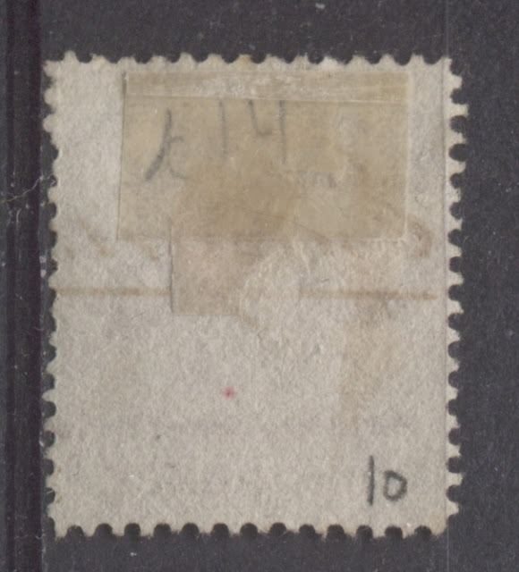
On the back, we can just barely make out the vertical mesh, though it is by no means clear. The watermark is also just barely visible.
Fifth Printing - Dispatched November 26, 1879
On this printing, the colour of the head plate is a deep, bright rose, while the duty plate is printed in a slightly paler bright rose. This is the only printing in which the duty plate and head plates are a different colour. Again, I have no mint examples, but I do have quite a few used examples, three of which are shown below:
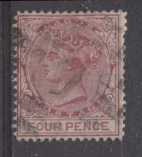
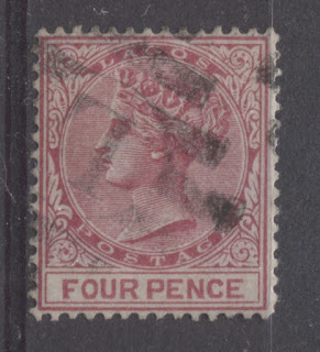
You have to look carefully, but if you look at these stamps long enough you can see that the words "four pence" are a lighter rose than the rest of the stamp.
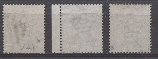
Looking at the backs, you can just make out the vertical mesh, and on 2 of the three stamps, the watermark is clearly visible.
Sixth Printing - Dispatched November 18, 1880
This last printing is in a shade of carmine rose. It is not bluish, nor is it a pure rose. It is a good balance between pure rose, and pure carmine. The duty plate and head plate are both the same colour.
I have one mint example and several used examples to show you here. There is some variation in the intensity of the shade, but not much variation in the tone.
Here is my only mint example:
Note how the colour is a good balance of rose and carmine, being neither one or the other. You can see that the stamp is comb perforated and the colour of the head plate and duty plate are the same.
Hopefully you can see that the gum on this example is thicker and creamy compared to the earlier colourless gum. It doesn't really show up in the scan, but it has the same slightly crackly appearance as the 3d chestnut, which was printed at the same time.
Now for the used examples:
Here you can see some slight variations in the shade, but all of them are very similar. They are all comb perforated, and the duty plate and head plate colours are the same.
The backs all show very feint vertical mesh and watermarks are visible on three of the four stamps.
That concludes my discussion of this complex value. At this point, I have covered the bulk of this second Queen Victoria Issue. The only values left are the 6d and the 1/-, which are much more straighforward. These will be the subject of next week's post. Then I will be ready to move on to the Third Queen Victoria Surface Printed Issue. This issue was printed using the same colours as before, but the paper is watermarked crown CA. The issue was in use from 1880 until 1884, when the colours were changed.


