Today's post picks up where I left off last week. I had sorted all of my 2.5d stamps into 71 groups, which was way, way more than the number of printings that were likely made. Given that the stamps were sent to the colony on a quarterly basis and the first printing was issued in April 1891, with the last printing being in August, 1901, there should be approximately 41 printings, as long as each sending included a batch of 2.5d stamps. Because the 2.5d was used to pay the new UPU foreign letter rate per half ounce, it is quite likely that there would have been a separate printing each quarter, to make up the total number of 428,040. This would suggest an average printing of 10,701 stamps each. However, the distribution of examples in the sample that I have sorted, makes it clear that the printings were not done evenly, and that some of the printings are very scarce to rare. Gibbons prices of course are for the most common printings, except for the scarce blue shade, which is from the first two printings made in 1891.
The basic shade catalogued by Gibbons is ultramarine, for both the head plate and the duty plate. However, as we shall see, this is a gross over-simplification, and there are many shades that cover the whole gamut. In addition, there are some printings where the duty plate and head plate colours are completely different, the scarcest of which is the April 1894 printing, which only exists without gum when mint, due to the fact that the entire shipment was stuck together when it was received in Lagos, with the result that the stamps had to be soaked apart.
In addition to the two listed types of value tablet, I have discovered a few other prominent plate flaws, which I suspect are likely constant:
The second of these occurs in the middle stamp at right. It shows a deformed type B inscription, but what is interesting, is that there is a clear deeper outline of a type A inscription underneath. So it appears that the type B inscriptions may be the result of retouching the duty plate where the inscriptions were weak or incomplete.
The basic shade catalogued by Gibbons is ultramarine, for both the head plate and the duty plate. However, as we shall see, this is a gross over-simplification, and there are many shades that cover the whole gamut. In addition, there are some printings where the duty plate and head plate colours are completely different, the scarcest of which is the April 1894 printing, which only exists without gum when mint, due to the fact that the entire shipment was stuck together when it was received in Lagos, with the result that the stamps had to be soaked apart.
In addition to the two listed types of value tablet, I have discovered a few other prominent plate flaws, which I suspect are likely constant:
- A badly damaged "2" at the top of the "2".
- Frame break under the "E" of "Penny".
- Deformed inscription. Under magnification, you can see that the type A inscription has been retouched to change it to to a type B inscription, as the ink is contemporary.
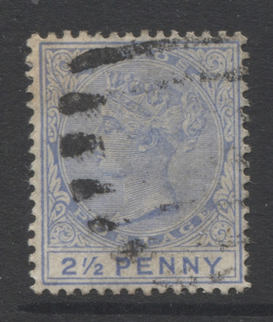
- Damaged "2" and pitted left outer frameline, resulting in a frameline that is much thinner than normal.
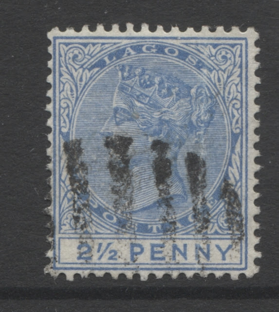
- Oblong mark to the left of the queen, where two of the horizontal shading lines have been joined and unshaded earlobe.
Without further ado, I give you my rundown of the printings of this stamp. Today's post will cover the first nine of these, and then next week, I will carry on and run through some more.
Group 1 - Printings 1-7
In this first group, the predominant state of the plate shows very little wear, with most examples in a sheet showing all the details of the hair clearly and the diadem clearly, with little to no merging of the hairlines. A few examples will show merging of the top 3-5 lines of the hair, but all the detail of the hair at the back of the head will still be clearly visible, as will all the detail of the jewels.
Printings 1-2 - The Listed Blue Shade
Both of these first two printings are very similar to one another. The main difference is that on the first printing, both the head plate and duty plate colours are the same, while on the second printing, the duty plate colour is quite a bit darker than the head plate colour.
First Printing
The head plate and duty plate shade of this first printing are both closest to the blue swatch of the Gibbons colour key, so the catalogue description is almost accurate. The only anomaly is that Gibbons lists the blue shade as having a Type A inscription only, and this one is clearly a Type B.
Second Printing
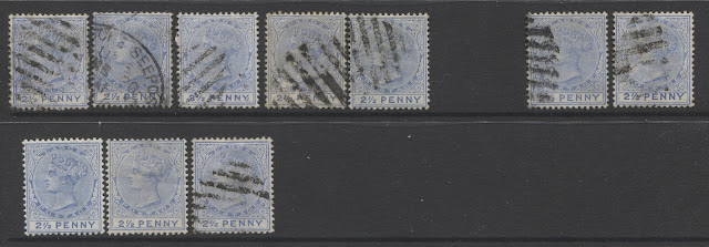
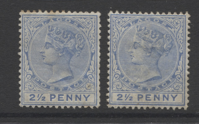
On this printing, the head plate is closest to blue, but the duty plate is dark blue. I have five used examples in my stock, all of which are cancelled with 8-bar oval obliterators, as one would expect, given that these printings are for 1891. I believe that the two examples on the left, are Type A inscriptions, while those on the right are Type B.
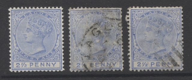
On this printing, I have, what I believe are two constant plate flaws. Further research and corroboration with other examples would be required to prove their status as constant. The first of these occurs on the second stamp from the left, and shows a Type A inscription with the inner frame broken under the "E" of "Penny".
The second of these occurs in the middle stamp at right. It shows a deformed type B inscription, but what is interesting, is that there is a clear deeper outline of a type A inscription underneath. So it appears that the type B inscriptions may be the result of retouching the duty plate where the inscriptions were weak or incomplete.
The retouching is particularly apparent when you look at the tops of the letters.
Printings 3-9 - Other Shades That Are Listed As Ultramarine
Third Printing
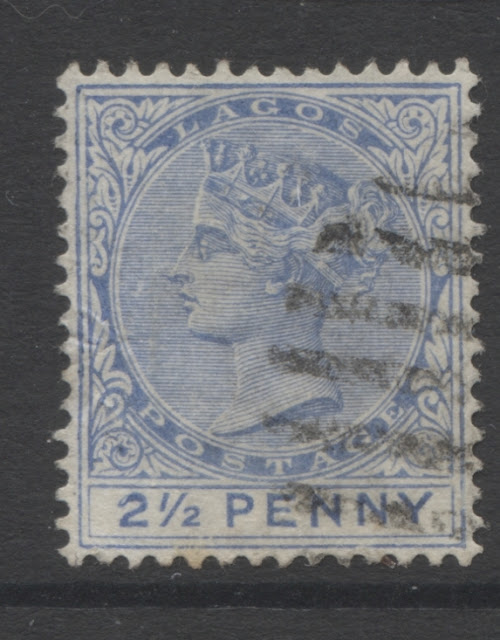
The next printing is very distinct in the sense that it is a very dull shade, that can best be described as pale, dull ultramarine, through it is not a match for either the dull ultramarine swatches, the grey blues, or the dull blue swatches. I have one unused example, which is in rough condition, and three used examples, which are also a bit rough. Two of these seem to have been cancelled with 8-bar oval obliterators, while the middle used stamp is clearly cancelled with a 9-bar oval. All four of the stamps that I have are type A inscription.
Fourth Printing
On this printing, the head plate is about half way between the cobalt swatch of the Gibbons colour key and the dull ultramarine swatch: it is brighter than dull ultramarine, but is much, much lighter than the colour of the third printing. The duty plate colour, is darker, being an almost exact match to the dull ultramarine swatch of the Gibbons colour key.
As shown in the above scan, I have two mint examples, both of which are type A, and 8 used examples, two of which are type B. One of the used type A's is cancelled with a German seapost cancel, most all of the others appear to be cancelled with either 9-bar ovals or 8-bar oval obliterators.
Fifth Printing
On this printing, the duty plate is closest to bright blue on the Gibbons colour key, and the head plate version is a very slightly paler version of the same colour. The inscription is clearly type A. This is a beautiful, perfectly centered mint never hinged example.
I also have two used examples as shown in the scan below:
Sixth Printing
On this printing, there is a very slight hint of periwinkle to the blue of the head plate. The colour of the head plate can best be described as what would result if you took the dull ultramarine swatch and combined it with the violet blue swatch of the Gibbons colour key, while making the whole colour lighter. The duty plate colour is almost an exact match to the dull ultramarine swatch of the colour key. I have one single used example, with type A inscription, and canceled with a 9-bar oval obliterator.
Seventh Printing
In this printing, the head plate and the duty plate are basically the same colour. The colour is closest to dull ultramarine on the Stanley Gibbons colour key. So this is the first printing where the colour is getting close to true ultramarine, the shade that is listed by Gibbons as the basic colour of the stamp. I have two examples of this printing in mint condition, and eight used examples, one of which is cancelled with a Lagos CDS. The other used examples all appear to be cancelled with 9-bar oval obliterators.
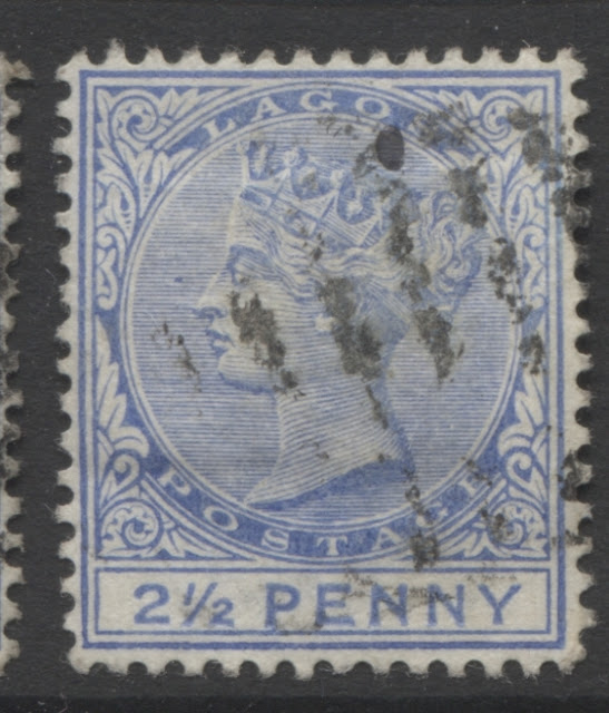
On this printing, I have come across what I think may be another constant plate variety: another instance of the "damaged 2", where the damage is further toward the end of the "2" and a severely pitted and thin outer left frameline. The scan below shows this more clearly:
Group 2 - Printings 8 Through 19
In this group of printings, there is a slight loss of sharpness to the detail in the design. Most examples show merging of the top three lines of the Queen's hair, while many copies will show merging of the top five lines. The detail of the diadem and jewels will still be completely clear, and there will be some detail visible in the hair at the back of the head below the diagonal ribbon.
Eighth Printing
The head plate and duty plate of this printing are largely the same colour, which is almost an exact match for dull ultramarine on the Gibbons colour key. I have one mint, and one used example, which appears to be cancelled with a 9-bar oval obliterator.
Ninth Printing
Ninth Printing
On this printing, the head plate and duty plate colours are still closest to dull ultramarine on the Gibbons colour key, but on this printing the colour is just a bit brighter, being a little bit closer to true ultramarine. I have two mint and seven used examples, all of which are type A. The used examples are mostly canceled with 9-bar oval obliterators, but there is one 8-bar oval as well. There is also an early example of the larger Lagos CDS dated June 29, 1897.
On this printing, I have an example of what may be yer another constant plate flaw: The queen's earlobe is missing the shading lines that are normally present, and there is a large oblong flaw jointing two of the horizontal shading lines to the left of the queen's eyes:
Note how white the earlobe is compared to how it usually looks, and note the flaw to the left of the queen's profile.
This concludes my discussion of the first nine printings of this value. Next week I will attempt to complete my coverage of the remaining printings.


