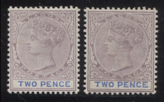
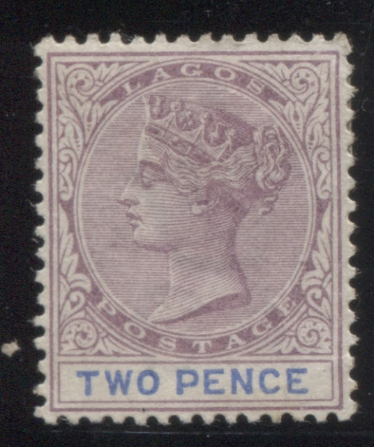
Today's post continues our examination of the printings of the 2d lilac and blue, or in the later printings, the 2d lilac and ultramarine. Last week, I looked at the very earliest printings, made, when the plate had sustained very little to no wear. This week, I start with those printings from the next state of the plate, in which the very first signs of wear begin to appear in the form of the merging of the first few hairlines at the top of the head, and a loss of detail in the hair at the back of the head. Most of these printings had duty plate shades, which are still in the blue and cobalt range, rather than the ultramarine range.
Group 2: Printings from the Second State of the Plate - Printings 11 to 27 - About December 1889 or January 1890 to About January 1894.
Eleventh Printing
Here is another, very large example, which was found on the twenty sixth printing:
Fourteenth Printing
What struck me about it was the very narrow left leg to the "N" and the narrow bottom to the "C", and then the narrow bottom to the "E". The combined effect of these anomalies is that the letters appear deformed, and abnormally thin.
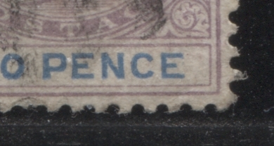
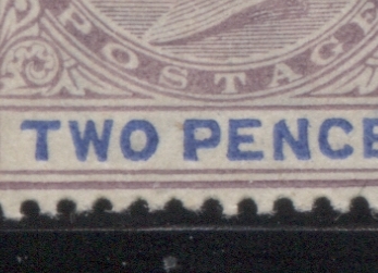
Another variety, which may well be constant is the frame break under the "N" of Pence. In fact, I'm fairly certain that I came across an inner frameline break at approximately the same place on the 2.5d value, which would suggest that it is indeed constant. Here is a close-up scan:
The head plate shade of this printing is closest to Gibbons' reddish lilac, but is just a touch duller. The duty plate is closest to Gibbons's blue, with the shade being just a bit deeper.
This is the first printing, after a long range of printings, where I have several mint examples, as shown above, and several used examples, as shown below:
Twenty Sixth Printing
Group 2: Printings from the Second State of the Plate - Printings 11 to 27 - About December 1889 or January 1890 to About January 1894.
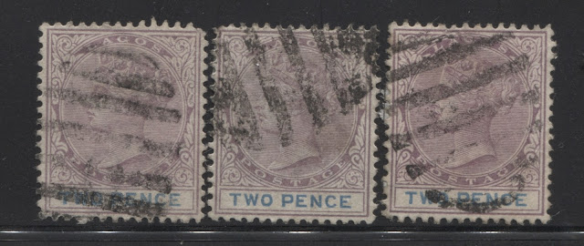
Eleventh Printing
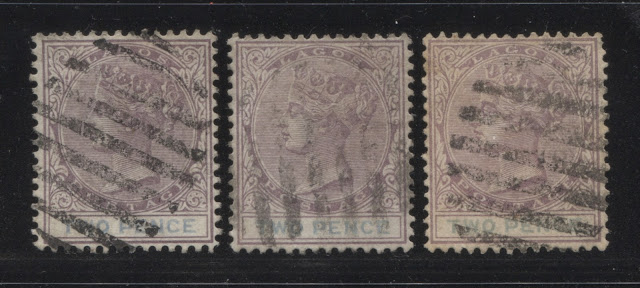
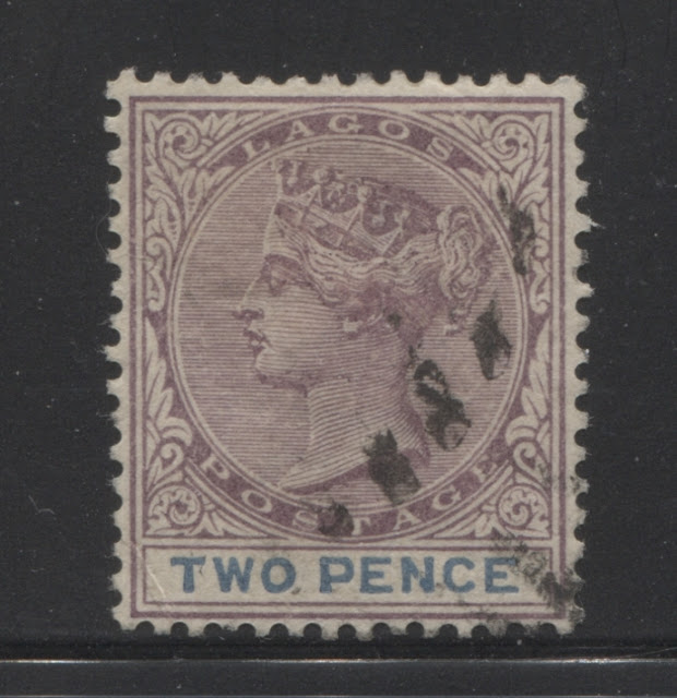
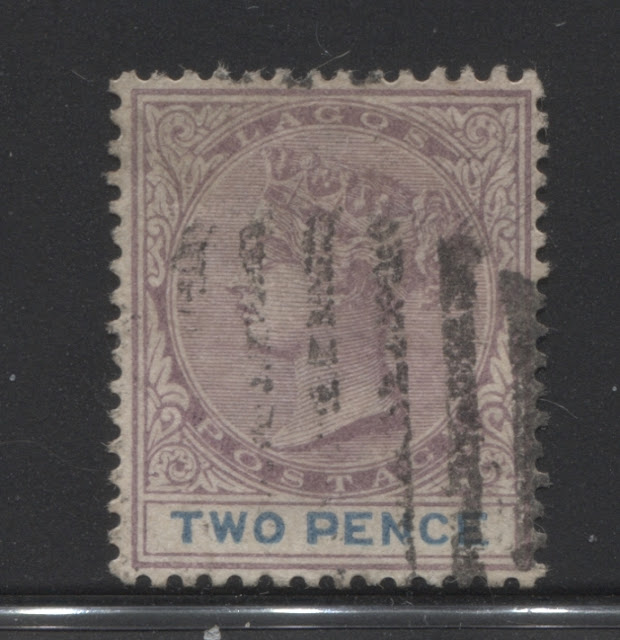
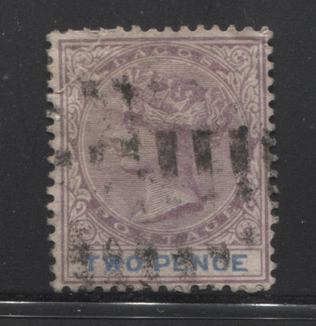
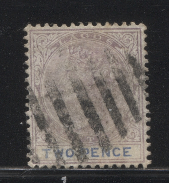
On this printing, the head plate colour is closest to Gibbons' dull purple, but is just a touch brighter. The stamp on the right is both brighter and paler, but this may be affected by soaking. I've grouped it here because the duty plate colour matched the other two stamps. The duty plate colour is an almost exact match to Gibbons's cobalt.
I do not possess any mint examples of this printing, and only three used examples, which suggests that it is a very scarce printing and shade combination. It is so distinct, that I have to wonder why Gibbons does not list it. The duty plate inks were singly fugitive, so it is not simply a case of the colour running or fading from exposure to water, and the existence of three used examples, from three different sources does suggest that this is indeed the original colour of the ink used for this printing. All three examples are cancelled with strikes of a 9-bar oval obliterator.
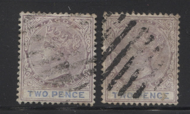
Twelfth Printing
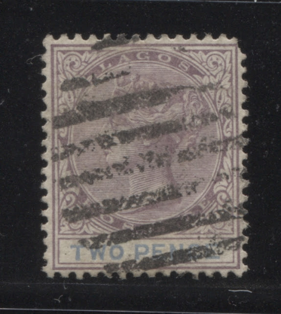
On this printing, the head plate colour is an almost exact match to Gibbons' dull purple. I almost grouped this with the eleventh printing above, as the duty plate colour is very similar to the eleventh printing above, but it is slightly greyish.
Regrettably, I have only the above used example, with a slightly rounded corner. This too is cancelled with a clear strike of a 9-bar oval obliterator.
Thirteenth Printing
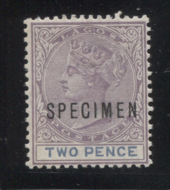
On this printing, the head plate colour is closest to Gibbons' slate lilac, but this colour is both slightly paler, as well as duller. The duty plate colour is tricky, as it has a slightly greyish cast, but it is too deeply blue to be any of the grey blues. It looks closest to Gibbons's royal blue, but is duller.
I have only the one mint example, with a specimen overprint. It is a fairly well established fact that the specimens were not always issued when the stamps first appeared. Sometimes, additional copies were made for distribution to various officials during the life of the issue.
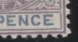
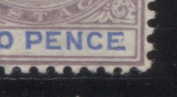
This printing shows a good example of a constant variety that occurs on all sheets of all 2d stamps, starting with those issued in 1874. It consists of a small mark, resembling either a comma, or accent that is opposite the middle bar of the "E" of Pence. It is not rare, as it occurs on several stamps in a sheet. I'm not sure of exactly how many, but it was not every stamp on the sheet, but perhaps 5% or so, would be a good estimate. Here is a close-up scan of what it looks like on this stamp:
Here is another, very large example, which was found on the twenty sixth printing:
Fourteenth Printing
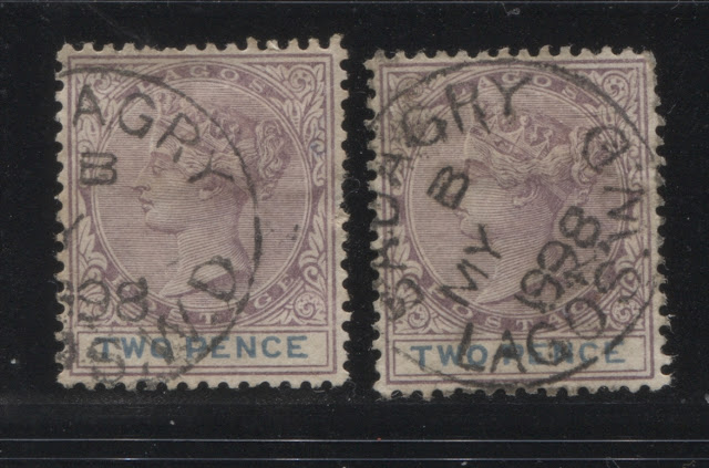
The head plate colour of this printing is closest to Gibbons's maroon, but is slightly lighter. The duty plate colour is an almost exact match to Gibbons's dull blue.
I have the above two used examples only, both of which are cancelled with what appears to be the same Proud type D3 May 1898 Badagry CDS. This is a reasonably scarce cancel, which is rated by Proud, to be 30x scarcer and more valuable than the more common Badagry cancels.
Fifteenth Printing
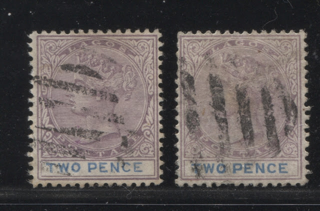
The head plate colour of this printing is closest to Gibbons's dull purple, but is just a touch paler. The duty plate colour is closest to Gibbons's blue. Maybe a bit duller, but certainly, very, very close.
Again, I have no mint examples of this printing. The used stamp on the left above is cancelled with a strike of a 9-bar oval obliterator, while cancel of the stamp on the right has the thicker bars, which are characteristic of the 8-bar oval obliterator.
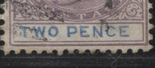
This brings me to another interesting variety involving the letters of the duty plate. There are a lot of very minor and small variations in the thickness of the letters, which are not that significant. However, this one was very striking:
What struck me about it was the very narrow left leg to the "N" and the narrow bottom to the "C", and then the narrow bottom to the "E". The combined effect of these anomalies is that the letters appear deformed, and abnormally thin.
Another variety, which may well be constant is the frame break under the "N" of Pence. In fact, I'm fairly certain that I came across an inner frameline break at approximately the same place on the 2.5d value, which would suggest that it is indeed constant. Here is a close-up scan:
Sixteenth Printing
The head plate colour of this printing is a very close match to Gibbons's maroon. However, it is just a little bit duller by comparison. The duty plate colour is very, very close to Gibbons's deep dull blue, but just a touch duller. But is is not deep enough to be the steel blue, nor dull enough to match any of the grey-blues.
I have only the sole used example shown above, with a barred oval cancel. I can't tell from what little of the cancellation that is visible, whether or not it is an 8-bar, or a 9-bar oval, however.
Seventeenth Printing
The head plate colour for this printing is closest to Gibbons's reddish lilac. The duty plate colour is also closest to the Gibbons deep dull blue.
Once again, I have no mint examples of this printing, and only the above used example, which appears to be cancelled with a strike of a 9-bar oval obliterator.
Eighteenth Printing
The head plate colour of this printing is hard to place, as it does not match any of the Gibbons swatches closely. It has the same tone as the reddish purple, but is way duller. I would say that it is what a dull reddish purple would look like if there was a swatch for it. The duty plate colour is closest to Gibbons' bright blue, but with a very slight hint of grey.
Again, I have no mint examples of this printing, and only the above used example, which, once again, appears to be cancelled with a strike of a 9-bar oval obliterator.
Nineteenth Printing
The head plate colour of this printing is closest to Gibbons's dull mauve, but is much darker. The duty plate colour is a perfect match to Gibbons's dull blue.
Again, I do not have any mint examples of this printing, but only the three used examples above. This time, they appear to be cancelled with strikes of an 8-bar obliterator.
Twentieth Printing
The head plate of this printing is a very close match to Gibbons dull purple, but this shade is slightly lighter than the Gibbons' swatch. The duty plate colour has the depth of Gibbons's royal blue, and is what many would think of when they hear the name "cobalt". It is lighter though than the Gibbons swatch.
This is the last, or a long run of printings, for which I have no mint examples, and only used, which is to be expected of the early printings of what was, a very heavily used stamp. The above two used examples are both cancelled, with what appear to be strikes of a 9-bar oval obliterator.
Twenty First Printing
The head plate shade of this printing is closest to Gibbons' reddish lilac, but is just a touch duller. The duty plate is closest to Gibbons's blue, with the shade being just a bit deeper.
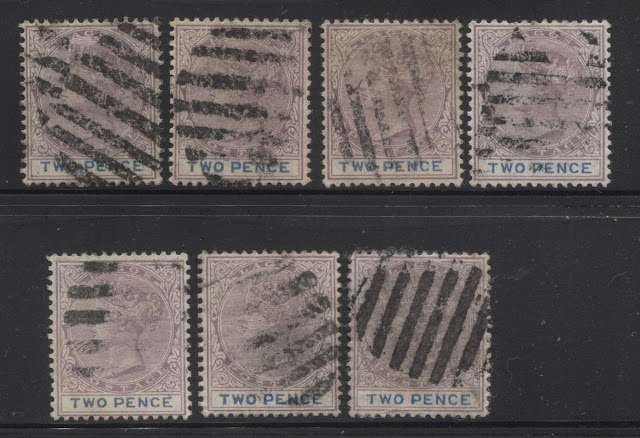
This is the first printing, after a long range of printings, where I have several mint examples, as shown above, and several used examples, as shown below:
It would appear that all but two of these examples, being the third stamp from the left in the top row, and the right stamp on the bottom row, are cancelled with strikes of an 8-bar oval obliterator. The other two stamps are cancelled with strikes of a 9-bar oval obliterator.
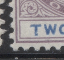
Included in this group is another constant plate flaw that goes back to the very beginnings of the 2d duty plate in 1874. I call it the "gouged T". There is a large void of the colour toward the bottom of the "T" of "two", which resembles a gouge. It would seem to be a very scarce variety, as only a handful of the many hundreds of 2d stamps in my stock since 1874 show this variety. However, of all the examples that I do have, there is at least one from each of the Crown CC issues, as well as the 2d slate crown CA. So I do know for certain that it is a constant variety that was never caught, nor corrected. Below is a close up scan of the flaw on the second mint stamp from the right, above:
Twenty Second Printing
The head plate shade of this printing is closest to Gibbons' reddish lilac, but is just a touch duller, as with the twenty first printing. The duty plate colour is similar to the blue of the twenty first printing, but it has a distinctly greenish tinge, which makes it closer to Gibbons's Prussian blue. However, it is a little deeper than the Gibbons Prussian blue swatch.
I have three mint examples of this printing, and two used examples. The used stamp on the left is definitely cancelled with a 9-bar oval obliterator, but with the stamp on the right, it is difficult to tell, because there are two overlapping strikes. But from the thickness of the bars in the cancel, it looks to me like a 9-bar oval as well.
Twenty Third Printing
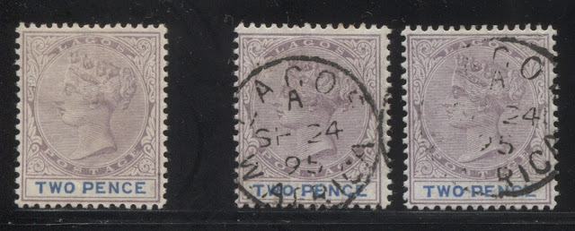
The head plate colour of this printing is closest to Gibbons's dull purple, but is slightly paler. The duty plate colour is a deeper version of Gibbons's blue. However, it is not deep enough to match the deep blue swatch in the Gibbons colour key.
I have a single mint example of this printing, and two used examples, both of which are cancelled with strikes of a Lagos CDS, dated September 24, 1895. This would appear to be one of the last printings made among this group.
Twenty Fourth Printing
On this printing, the head plate colour appears to be closest to a deeper version of Gibbons's dull mauve. However, this stamp looks like it may be affected by some fading of the colour, so it is difficult to say with certainty. The duty plate colour is closest to Gibbons's royal blue.
I do not have any mint examples of this printing, and just this sole used example, which is cancelled with a strike of a 9-bar oval obliterator.
Twenty Fifth Printing
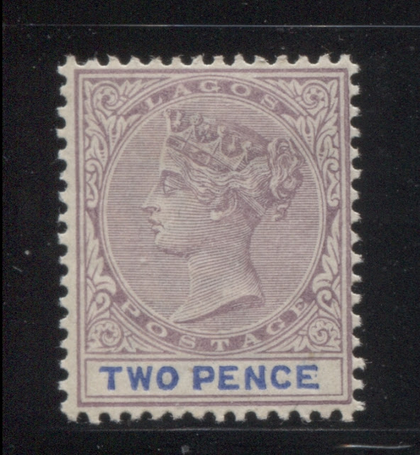
The head plate colour of this printing is closest to Gibbons's reddish lilac, but is just a touch duller. The duty plate colour is an exact match to Gibbons's ultramarine - the very first printing to live up to the description of this stamp in Gibbons, which only lists it as lilac and ultramarine.
I have just the one mint example of this printing, shown above.
On this printing is an example of another constant variety which affects the lettering. This time it is in the form of a truncated upper left corner of the "N" of "Pence".
Twenty Sixth Printing
The head plate colour of this printing is closest to grey-lilac, but is paler. The duty plate colour is an exact match to Gibbons's dull ultramarine.
I have no used examples, but I do have two mint examples as shown above.
Twenty Seventh Printing
The head plate colour on this printing is closest to Gibbons's reddish lilac, but is just a touch deeper. The duty plate colour is also a near perfect match to Gibbons's dull ultramarine.
Again, I have no used examples of this printing, and only one mint example as shown above.
This brings me to the end of this series of printings. The next series, which I will cover next week show the next stage of plate wear, in which there is a loss of overall sharpness, a loss of detail in the hair at the back of the head, and especially that below the diagonal ribbon, and merging of at least the top 5 hairlines on the head.


