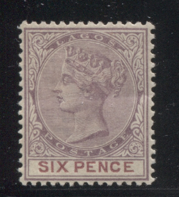
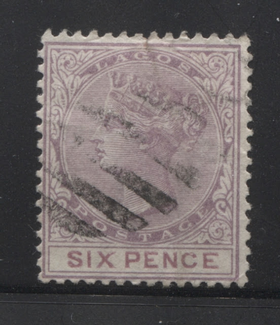
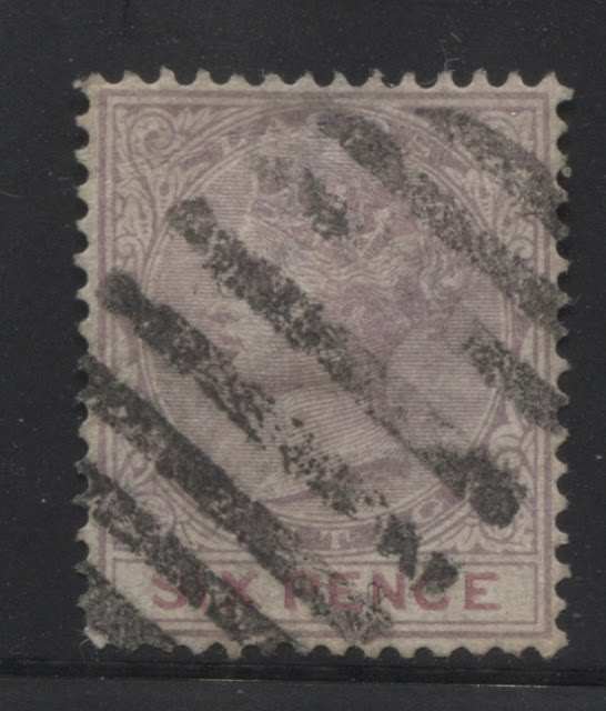
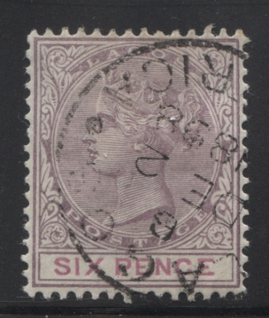
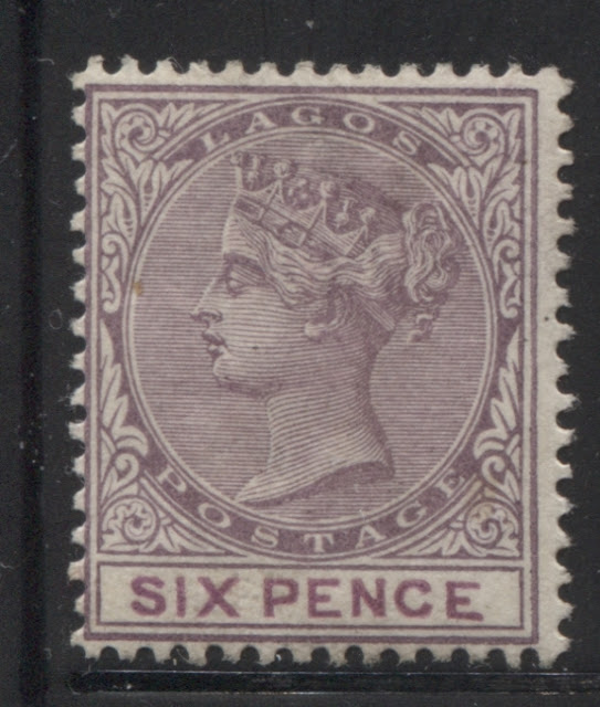
Today's post will examine the next group of printings of this stamp, being those from the second state of the plate. In this state, all of the detail in the hair is clear, as before, but is less sharp, as the plate begins to wear. We see the very beginnings of hairlines merging together at the top of the head and in the hair at the back of the head, especially those hairlines located underneath the diagonal ribbon at the back.
Group 2: Printings 11-19 Printings From the Second State of the Plate (December 1890 - Early 1892)
For the next three printings, the possibility does exist that they are merely variations of the second printing and are merely more heavily inked than those. However, I have assumed that the loss of sharpness in the detail is due to plate wear, and hence, I have classified them as being from the second state of the plate. I have determined that the last of these printings would have to have been made no later than early 1892, due to the fact that I have an used stamp from the third state of the plate that is cancelled with a Lagos CDS dated October 1892.
Eleventh Printing
For this printing, the frame plate colour is very close to Gibbons's deep dull purple, but there is a touch more red in the colour compared to the Gibbons swatch. However, it is nowhere near as red as the deep reddish purple. The duty plate colour is tricky, as there is too much purple for it to be a match to any of the clarets, brown purples or maroons. But at the same time it is quite dull. It looks to me like a dull version of Gibbons's deep reddish purple, so I would call it deep dull reddish purple.
I have no used examples, only the three mint examples shown above.
Twelfth Printing
The frame plate colour of this printing is identical to the last, which is to say that it is a deep dull purple containing a hint of red. The difference lies in the duty plate colour, which is more reddish and less purple, being a very close match to Gibbons dull claret.
Again, I have no used examples, and only the two mint examples shown above.
Thirteenth Printing
The frame plate colour of this printing is quite a bit more reddish than the other two printings. It is close to Gibbons's plum shade, but is both slightly paler and duller. The duty plate colour is closest to Gibbons's deep reddish purple and the dull claret, almost being a perfect blend of the two colours. But for simplicity's sake, I would call it deep dull reddish purple, as it is similar to how a dull version of the deep reddish purple would look.
Once again, I have no used examples and only the single mint example shown here.
Fourteenth Printing
The frame plate colour of this printing is a deep version of Gibbons's reddish lilac, while the duty plate colour is closest to Gibbons's purple, but is just a touch duller.
Again I have no used examples. One of the two mint examples shown here has a specimen overprint, which does suggest that the specimen overprints continued to be distributed well after the stamps were first issued.
Fifteenth Printing
I checked my examples of the 6d green and 6d sage green from the earlier issues, and did not come across this flaw on any of them, which suggests that it may have originated on this issue only.
Nineteeth Printing
The frame plate colour of this printing is somewhat problematic. It is the same intensity as the reddish lilac, but is way too dull to be a match. At the same time, the shade is quite reddish. I compared it to the dull purple and found that it is a much closer match, but again too reddish to be an exact match. So I would call it dull reddish purple. The duty plate colour is an almost exact match to Gibbons purple.
I have five mint examples and two used ones, both of which are cancelled with barred oval obliterators, though it is difficult to tell if they are 8 or 9 bar. The narrow width and wide spacing of the bars tends to suggest that they might be 9-bar ovals, but it is difficult to be sure.
This group of stamps contains another example of the broken "S", this time with just a nick out of the bottom of the "S". It is the top right stamp in the group above. A close-up scan of the variety is shown below:
I first noticed this flaw on the 6d sage green from the 1882-86 issue, but on that issue the "S" is completely broken at the bottom.
In addition to this flaw, I have found another notable variety that I have only seen on this issue: the "fat bottomed S". Normally the bottom of the "S" is the same width on the top. But on this variety, it is much, much wider. It occurs on the middle stamp in the bottom row above. A close up of the variety is shown below:
Group 2: Printings 11-19 Printings From the Second State of the Plate (December 1890 - Early 1892)
For the next three printings, the possibility does exist that they are merely variations of the second printing and are merely more heavily inked than those. However, I have assumed that the loss of sharpness in the detail is due to plate wear, and hence, I have classified them as being from the second state of the plate. I have determined that the last of these printings would have to have been made no later than early 1892, due to the fact that I have an used stamp from the third state of the plate that is cancelled with a Lagos CDS dated October 1892.
Eleventh Printing
For this printing, the frame plate colour is very close to Gibbons's deep dull purple, but there is a touch more red in the colour compared to the Gibbons swatch. However, it is nowhere near as red as the deep reddish purple. The duty plate colour is tricky, as there is too much purple for it to be a match to any of the clarets, brown purples or maroons. But at the same time it is quite dull. It looks to me like a dull version of Gibbons's deep reddish purple, so I would call it deep dull reddish purple.
I have no used examples, only the three mint examples shown above.
Twelfth Printing
The frame plate colour of this printing is identical to the last, which is to say that it is a deep dull purple containing a hint of red. The difference lies in the duty plate colour, which is more reddish and less purple, being a very close match to Gibbons dull claret.
Again, I have no used examples, and only the two mint examples shown above.
Thirteenth Printing
The frame plate colour of this printing is quite a bit more reddish than the other two printings. It is close to Gibbons's plum shade, but is both slightly paler and duller. The duty plate colour is closest to Gibbons's deep reddish purple and the dull claret, almost being a perfect blend of the two colours. But for simplicity's sake, I would call it deep dull reddish purple, as it is similar to how a dull version of the deep reddish purple would look.
Once again, I have no used examples and only the single mint example shown here.
Fourteenth Printing
The frame plate colour of this printing is a deep version of Gibbons's reddish lilac, while the duty plate colour is closest to Gibbons's purple, but is just a touch duller.
Again I have no used examples. One of the two mint examples shown here has a specimen overprint, which does suggest that the specimen overprints continued to be distributed well after the stamps were first issued.
Fifteenth Printing
On this printing, the frame plate colour is paler, being a very close match to Gibbons's reddish lilac. The duty plate colour is close to Gibbons's purple, but is noticeably paler.
I have only the one used example of this, and it shows some interesting flaws in the lettering of "six pence" which are consistent with some of the other flaws that I have written about in this issue so far. If you look at the top of the "C", The top right leg of the "X" and inside the "S", you will see white patches where the ink did not transfer properly. However, this could also result from damage to the letter, which will be proven if other examples can be found that establish that it is a constant variety. I did not see this damage on any of the earlier 6d's which suggests that it likely originated with this issue, but more research will be needed to establish this with certainty.
Sixteenth Printing
This is another printing for which I have only a single used example, and it is a nice example of a nearly complete strike of the 8-bar oval obliterator. The frame plate colour is similar to Gibbons's reddish lilac, but is both paler and duller. So I would call it pale, dull reddish-lilac.
Seventeenth Printing
The frame plate colour of this printing is very similar to the fourteenth printing, being a deeper version of the reddish lilac shade. The duty plate colour is very distinct, and is closest to Gibbons's bright purple. It is just a touch deeper.
Again, I have no mint examples of this printing - just the beautiful used example shown above. It is the wider Lagos CDS with the large dots at the side, dated December 2, 1898, which is a relatively late use.
Eighteenth Printing
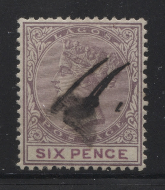
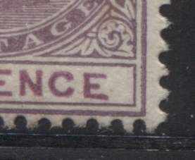
The colours of both the frame and duty plate colours of this printing are very distinct, and have lost any hint of claret or brown in the colours. The frame plate colour is closest to Gibbons's deep reddish lilac, while the duty plate colour is closest to Gibbons's deep purple. I have the mint example shown above and the single used example, which has been cancelled using a pen shown below:
Both of these stamps exhibit a very prominent plate flaw involving the last "E" of "Pence". It would appear to be constant, due to the existence of these two examples. In this flaw, the bottom horizontal bar of the "E" is seen to slope noticeably downward, so that the end of the bar is much closet to the bottom frameline than the base is. This variety is very noticeable even from afar. A close-up scan of this flaw is shown below:
I checked my examples of the 6d green and 6d sage green from the earlier issues, and did not come across this flaw on any of them, which suggests that it may have originated on this issue only.
Nineteeth Printing
The frame plate colour of this printing is somewhat problematic. It is the same intensity as the reddish lilac, but is way too dull to be a match. At the same time, the shade is quite reddish. I compared it to the dull purple and found that it is a much closer match, but again too reddish to be an exact match. So I would call it dull reddish purple. The duty plate colour is an almost exact match to Gibbons purple.
I have five mint examples and two used ones, both of which are cancelled with barred oval obliterators, though it is difficult to tell if they are 8 or 9 bar. The narrow width and wide spacing of the bars tends to suggest that they might be 9-bar ovals, but it is difficult to be sure.
This group of stamps contains another example of the broken "S", this time with just a nick out of the bottom of the "S". It is the top right stamp in the group above. A close-up scan of the variety is shown below:
I first noticed this flaw on the 6d sage green from the 1882-86 issue, but on that issue the "S" is completely broken at the bottom.
In addition to this flaw, I have found another notable variety that I have only seen on this issue: the "fat bottomed S". Normally the bottom of the "S" is the same width on the top. But on this variety, it is much, much wider. It occurs on the middle stamp in the bottom row above. A close up of the variety is shown below:
As you can see it is quite a prominent variety as well. I do not yet know if it is constant, as this is the only example of the 6d where I have come across it.
This concludes my discussion of these printings. Next week, I will look at the printings from the third state of the plate.


