Brixton Chrome
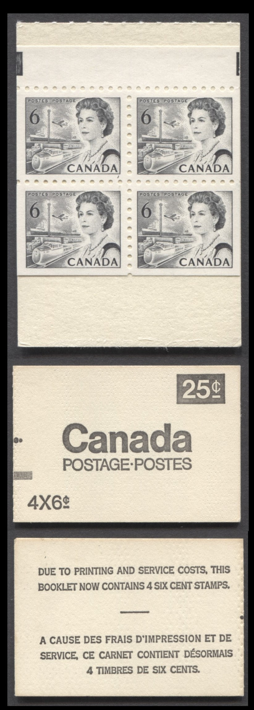
Canada McCann #BK62a 1967-1973 Centennial Issue, A 25c 6c Black, Pane Of 4 Booklet, DF Pane With Glossy Dex Gum, Die 2, Perf. 10, Coarse Printing Of Back Cover, Counter Booklet, Dimpled Cover Stock
Canada McCann #BK62a 1967-1973 Centennial Issue, A 25c 6c Black, Pane Of 4 Booklet, DF Pane With Glossy Dex Gum, Die 2, Perf. 10, Coarse Printing Of Back Cover, Counter Booklet, Dimpled Cover Stock
Couldn't load pickup availability
A complete 25c 6c black, pane of 4 booklet from the 1967-1973 Centennial Issue with a DF pane with glossy dex gum. Die 2, perf. 10. Coarse printing of back cover, counter booklet. Dimpled cover stock. Unitrade values this booklet at $15.
The booklet offered here grades 75 as follows:
Centering/Margins: 45/70
Cover Freshness: 10/10
Condition of Cover Edges: 5/5
Freshness of the Panes: 5/5
Absence of Visible Cover Flaws or Stains: 5/5
Condition of Interleaving and Contents: 5/5
Although not listed separately in any of the major Centennial issue handbooks (Unitrade, Harris and McCann), it is clear that the integral booklet covers display some important differences with respect to the appearance of the cardstock used for the covers, as well as the appearance of the printing on the back covers. Four differnt types of cream coloured stock are generally found: (1) a smooth stock, (2) a rough textured stock, (3) a smooth textured stock that contains many dozens of dimples, from being passed through a roller machine (called dimpled stock) and (4) a stock that shows very light horizontal ribbing when viewed at an angle (this we refer to as the lightly horizontally ribbed stock.
The printing found varies from fine, to medium, to coarse. The fine printing is thin, with letters that are of uniform thickness. It appears, from my study of these booklets to be the leastcommon of the three types. The medium printing is darker and the letters are thicker, but they are still of uniform thickness with none of the letters appearing distorted. The coarse printing is usually very dark, due to over-inking. The letters are not of even thickness, with some being clearly thicker than others.
Share