
The booklets issued between 1985 and 1988 depicting the Parliament buildings in Ottawa are a perfect example of an issue that at first appears to be very simple, but is actually quite complicated. These were the last engraved definitive issue booklets to be printed, and the second last of the 50c vending machine booklets. There were two issues after this one that depicted the Canadian flag, but by 1991, the practicality of these booklets was non-existent, because the postage rate for first class mail was such that users would only get 1 usable stamp from a booklet, and the whole idea of these booklets was originally to give at least 2 or three usable first class stamps.
These booklets came out right around a time when there was a lot of turmoil in the supply chain by which Canada Post obtained its paper, resulting in a lot of different paper suppliers. These booklets were printed using Abitibi, Harrison and Rolland papers. Abitibi-Price went bankrupt in 1985, so only the first printings of the first booklet were printed using this paper. The rest were produced using the other two suppliers. I always get excited when I see issues printed using Rolland paper because there are so many neat varieties of front and back fluorescence with this particular supplier.
The stamps in these booklets are highly attractive designs and they are printed in some very nice colours that are not often seen on the stamps of this period. This makes them a very attractive prospect for specialized collecting. Now, it is true that McCann lists a lot of tagging varieties, which in truth are caused by tagging shifts or inexact cutting of the panes. Some collectors frown upon these types of varieties, but I think they are still highly collectible to someone who wants to tell the full story of the production of these booklets and needs to illustrate what happens when the tagging is not properly aligned with the booklet, or when the guillotine is not perfectly lined up with the cutting guidelines on the pane tabs.
There were 4 booklets involved in this issue of this design and two from this issue with the previous maple leaf design. They cover the four rate increases that occurred for first class mail during these years: 34c, 36c, 37c and 38c. The remaining face value was made up by including various 1c, 2c, 5c and 6c make-up stamps. In Unitrade these booklets are BK88, BK92, BK96 and BK100. BK88 had 6 stamps to a pane, while BK92 and 100 had 5 and BK96 had 4. The idea behind the make-up stamps was to enable a person to be able to mail a first class letter within Canada or to the US if all they had was either the booklet, or a first class stamp from the prior rate period. Thus the 1c and 2c stamps were intended to be used with out-dated stamps, while the 5c and 6c stamps were intended to be used to pay the difference between the domestic and US rate. In practice very few were used this way, with the result that single low value stamps used in period are quite hard to come by.
This is the first and only booklet produced where only 1 stamp was intended to be tagged. The tagging is also on all 4 sides for the first time on a first class rate stamp. However, as we shall see, due to shifts in the application of the taggant, various varieties can be found.
Unitrade presents all four of these booklets in a very simplified fashion, listing but two printings of each one, with the difference lying in the covers. McCann does a better job of identfying at least 2-4 printings of each booklet and manages to identify most, but not all varieties. I have just gone through a lot of approximately 950 booklets and I can say with confidence that while McCann's listings of BK88 and BK92 are fairly complete (70-80%), he has completely overlooked several significant varieties on BK96 and BK100. My goal here then is to shed some light on all these varieties here and outline the collecting possibilities that exist with these.
The varieties of these booklets can be broken down into two broad groups:
- Varieties involving the cover.
- Varieties of the pane.
The varieties involving the cover, other than the 10 cover designs that these booklets come with, can include the colour of the card stock, which varies from a pure drab, to a more pinkish drab colour; whether or not there is an "H" or "R" on the back of the cover, the size of that letter, and the reaction of the paper stock under UV light. McCann mistakenly refers to the "H" covers as Abitibi covers. This cannot be the case, as Abitibi was out of business by 1987 when these covers first appear. The "H" does in fact stand for "Harrison", which was the supplier of the paper used for the last printings of BK92 and all the printings of BK96 and BK100.
The varieties found on the panes themselves include:
- Plate flaws and printing voids on some of the stamps.
- Tagging varieties caused by shifts.
- Differences in the pane lengths. Most of BK88 are 70 mm long, while most BK92, 96 and 100 are 80 mm long. However, you will find a few instances where the pane can be 0.5-1.5mm longer or shorter than the average length.
- Differences in paper fluorescence, both on the front and the back of the pane. The first printings of BK88 were on uncoated Abitibi paper, so the fluorescence reading is the same on both sides. But, once the paper becomes coated, as with all Harrison and Rolland papers, the fluorescence readings on the front and back are often different, and this just adds to the fun.
- Instances where there are two strikes of the perforator on the right side of the pane in close succession resulting in one double perf. Also there are instances where a single perforation hole appears at the top of the tab in the centre.
So, when you consider the number of attributes that can vary, and the fact that all variants can exist with one another, you can see very quickly that with 10 different cover designs, the number of collectible varieties can become very extensive, very quickly.
Let's start by taking a look at the actual booklet panes and the different covers.
Pane and Cover Designs for BK88

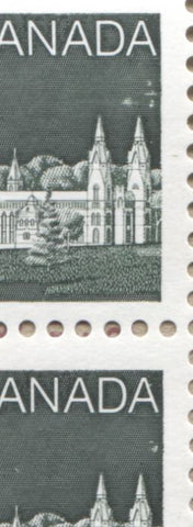
Here is the pane of the first booklet. As you can see, there are two cutting guides located on the tab, three 2c stamps, a pair of 5c stamps and the 34c stamp. There are no other markings on the tab.
The 10 cover designs are printed in brown against the drab background of the covers and look like this:

The carved head cover

The carved stone ornament cover
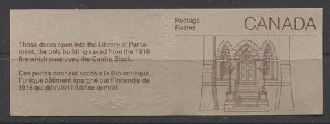
The doors to the library cover

The gargoyle cover

The Indian mask cover

The ironwork cover

The Peace Tower cover

The stone carving cover

The war memorial cover

The windows cover
You will see that each cover has a small write up on the back about the particular architectural element featured on the cover. Initially this is all that appears on the back. Later printings of this booklet have an "R" on the back in the lower left corner. The "R" stands for "Rolland" of course. There are three sizes in which the "R" is found:
- 1.3 mm tall with short legs.
- 1.5 mm tall.
- 1.7 mm tall.
For some reason McCann properly identifies and lists these differences on the printings of BK92, but not on this booklet, even though all three exist. Here is a comparison scan of the three types:

Type 1 is on the left, type 2 in the centre and type 3 on the right.
Pane and Cover Designs for BK92

Here is the pane for plate 1, which was printed on Rolland paper. Plate 2 was printed using Harrison paper, and looks the same, except for the plate number and an "H" instead of the "R". Here, there are only five stamps and a printed label. The make up stamps consist of a pair of 1c and 6c stamps.
The cover designs are the same, except that they are printed in blackish green on the drab covers as follows:

The carved head "Harrison" cover.

The carved head "Rolland" cover

The carved stone ornament "Harrison" cover

The carved stone ornanment - "Rolland" cover

Library doors "Harrison" cover

Library doors "Rolland" cover

Gargoyle "Harrison" cover

Gargoyle "Rolland" cover

Group of windows "Harrison" cover

Group of windows "Rolland" cover

Indian mask "Harrison" cover

Indian mask "Rolland" cover

Ironwork "Harrison" cover

Ironwork "Rolland" cover

Peace Tower "Harrison" cover

Peace Tower "Rolland" cover

Stone carving "Harrison" cover

Stone carving "Rolland" cover

War memorial "Harrison" cover

War memorial "Rolland" cover
These covers all have an "H" or an "R" on the back in the lower left corner. McCann correctly identifies the difference between types 1, 2 and 3 "R"'s, but does not do so for the "H"'s. It turns out that there are also three types of "H"'s, which are the same heights as the "R"'s.
Pane and Cover Designs for BK96

Here is the pane with the blue tab markings, which was the first printing of this booklet. Here there are two labels, one at the top left and one at the bottom left. This booklets contains a pair of 6c make up stamps and one 1c stamp.
The covers at this point are all Harrison covers, so all have an "H" in the bottom left corner on the back. The H's exist with all three types that are found on the last booklet. These covers are all printed in dark blue on the drab covers.
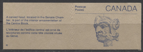
Carved head cover

Carved stone ornament cover

Library doors cover

Gargoyle cover

Group of windows cover

Indian mask cover

Ironwork cover

Peace Tower cover

Stone carving cover

War memorial cover
Pane and Cover Design for BK100
These covers at first look very similar to BK88, but upon closer examination the ink is a much redder colour, being a brownish red, rather than a deep reddish brown. There is also a golden cast to the drab colour of the cover stock. Like BK96, I believe these are all Harrison covers. McCann and Unitrade both identify a "Rolland" cover with an "H" on the back, but I believe that these are simply fluorescent versions of the Harrison cover, which is normally dull under UV.

Here is the pane on this booklet. A few things stand out immediately compared to the other, earlier panes:
- The coating on the surface of the paper is obvious and causes the paper to curl inwards.
- The booklet is back to containing 5 stamps, but now it is three 2c stamps and one 6c stamp.
- The 2c stamps from these booklets are a much deeper and duller shade of green than the ones from BK88 and can be readily distinguished on this basis.
- All of the booklets have only the green lines across the tab and the shade of the green ink used to print these bars is much darker than that used on some printings of BK92.
Now, let's take a look at the covers and then I can get into the types of varieties found on the covers and the panes. I'm not going to show all 10 covers this time, because they are all identical to the others except for the ink colour, so I will show one, just to highlight the difference:

The carved head cover, note the much redder colour of the ink.
Varieties of the Covers
In terms of varieties that can be found on the covers, the main ones are:
- Differences in the type of "R" or "H" on the back.
- The presence or absence of gripper marks on the covers. These are generally not listed in any of the catalogues.
- Differences in the fluorescence of the cover stock. McCann characterizes these differences as being useful in distinguishing between Rolland and Harrison covers, but my belief is that they can be found on most all of the printings, though some are indeed useful for identifying certain printings.
- Pre-print creases. I didn't know these existed until I came across a single, solitary example on BK88, which I will show here.
- The presence of taggant on the covers. Again, I was unaware that such varieties existed until I went through the booklets I just bought and found two such varieties.
- The presence or absence of counting marks. These were applied by BABN to every 50th booklet. However, the actual scarcity of these is somewhat more than 50x, as in the entire lot of 950 booklets that I sorted, I wound up with less than 15 counter booklets, when I should have had around 20.
- Differences in the colour of the stock. It would appear from differences in the colour of the edges and centre of some colours that the acids in the stock can change the colour over time, but examples where the colour is different all the way through may indicate use of different card stocks.
- The presence of private overprints and handstamps applied by stamp clubs. Many are just handstamped on the front cover, but some are actually professionally printed.
- On a few booklets I found errant black text that while not readable appears to have come from something else BABN was printing and where the ink transferred onto the covers. These were rare in that I only foud 2 or 3 examples.
I have already illustrated the different types of "R's and explained that the H's can be found with similar variations. The gripper marks consist of a column of depressions on the front of the cover, about 4-5 mm in from the right edge. They are caused by grippers in the vending machines that retrieve the booklets for dispensation. They look like this:

The booklet on the left is without any gripper marks while the one on the right bears the distinct markings.
The general appearance of the covers under UV light usually is dull, which simply means that the drab colour appears darker, and in the case of BK100, very dark. However, low, medium and high fluorescent versions can be found as well. Generally the fluorescence appears as an overall violet grey, greyish white or grey green colour, with fluorescent fibres visible in the cover, in varying concentrations. Some examples are shown below:

Both of these covers are the high fluorescent rolland covers, but the one on the left looks dull compared to the one on the right. The booklet on the left is the greyish tone, while the one on the right is the violet grey tone of the later printings.

Here is a scan that shows the stark difference between a dull Abitibi cover on the left and a high fluorescent Rolland cover on the right.
The pre-print crease that I have come across on BK 88 is shown below:

You can tell that is is not a post-printing crease by the fact that the letter "o" and "s" are both defective and contain breaks where the crease is. This will only occur when the crease was in the card stock before the printing took place.
Finally, I have found two examples of booklets where taggant appears on the cover. The first instance appears to be general smearing of taggant on the cover, while the second is an outline of a stamp edge.

Tagging smears on the Peace Tower cover of BK88

Taggant outline on Gargoyle cover of BK92
So what is the significance of these freak varieties? Well, for one thing they show that the booklets were tagged prior to be assembled. This is an important detail to a collector trying to tell the full story of their production.
The counting marks vary in intensity and width, and are generally found near the centre of the booklet spine. An example is shown below:

BK88 with counting mark on the Gargoyle Abitibi cover
As explained above, the card stocks may change colour slightly over time due to the chemicals or acids in the stock. I've seen booklets where the very edges are a different colour from the rest of the cover. But I have also seen examples of the same booklet where the entire cover is a much pinker colour than the usual drab colour, as shown below:

The cover on the left is the usual drab, while the one on the right is a more pinkish drab.
This lot that I have been working on contained quite a few examples of covers with stamp club overprints and handstamps. I show them all below:

Collingwood Coin and Stamp Club overprint on BK88. This one is professional.

Oakpex 87 red handstamp on BK88.

Oakpex 86 black "Colour Specimen" handstamp on BK88.

Collingwood Coin and Stamp Club red overprint on BK88.

Stoney Creek Stamp Club overprint on BK88.

Oakpex blue handstamp on BK96.
I have no idea how many booklets had their covers altered in this fashion, or which covers, but I have to imagine that they are very, very scarce in light of the fact that they would have been limited to the number of expected attendees at the stamp shows for which they were produced, which was very unlikely to be more than a few hundred, as they were mostly small, local shows. The existence of these gives some clue as to how much more promotion the hobby received back then compared to today. When was the last time you saw something like this as a stamp show?
The last item in the covers is the errant black text. There appears to be no rhyme or reason to where it appears, as it is ink transfer from something else BABN was printing. One example is shown below:

That's it for the covers. In terms of the panes I have already outlined what the main types of varieties. What I want to do now is discuss them and show some examples.
Variations in Pane Tagging
The standard tagging on all these booklets is a GT-4 square tag on the first class stamp in the lower right corner. When the tagging has been applied properly the tagging should lie on the margins of the stamp outside the design and should not appear anywhere else on the booklet. However, shifts in the placement of the tagging results in many variations. None of these are listed in Unitrade and most, but not all are listed in McCann. These varieties are:
- Minor shifts where the tagging encroaches into the design, usually the trees or "Canada". These are generally not listed in any of the catalogues.
- The appearance of a left tag bar on the bottom label. This bar can be a very narrow sliver to a wide 2-3 mm bar. This is listed in McCann.
- The appearance of a narrow horizontal bar on the top right of the tab. Usually this will occur in conjunction with the left bar on the label. This is listed in McCann.
- No right bar on the first class stamp, due to the shifting of the tagging to the left. Usually this will be accompanied by the label having a single tag bar that resembles a "1" in shape. This is listed in McCann.
- Shifts that result in a very narrow right bar on the first class stamp. Sometimes McCann lists this, but not most of the time.
- Errant tagging spots on the design, or in the tab. These are not listed in any catalogue.
- Ghost bars and tag washes on the pane of varying widths. McCann lists a few, but not most of these.
- Some panes can be found completely untagged. These are errors and are quite rare.
Let's take a look at some of these now:

Slight downward shift of the tagging into "Canada"

Here is a BK88 with a ghost tag bar on the tab and a left bar on the label. There is also a very slight upward shift in the tagging, causing the very bottom of both 5c stamps to have tagging in the bottom margins.

Here is an example where the right bar is almost missing on the 34c. We call this the "harline bar".

BK88 with a tagging spot on the tower.

BK 88 with a tag spot on the tab and top right 2c.

BK88 with harline tag lines accross the stamps.

BK 92 with both a left bar on the label and a horizontal tag bar on the tab.

BK92 with tag wash accross the top stamps

BK96 - taggant on label

BK100 with tagging blotch on upper left stamp.
The varieties that result from the minor shifts are fairly common. But the other varieties are all fairly scarce, with only the examples I show you here croping up in a large lot of over 950 booklets.
Variations in Fluorescence
The largest variations in paper fluorescence occur on the Rolland papers, which were used for a portion of the printings of BK88 and BK92. On the coated Rolland paper, the fluorescence readings on the front and back are different. The Abitibi papers, which were only used on BK88, show much less variation than the other papers, being either DF-fl or LF-fl. The Rolland papers can be found in all levels of fluorescence, including dead, DF-fl, LF-fl, MF-fl, and HF-fl. The Harrison papers, which at first appear to only be DF, are actually found in dead, DF and LF levels of fluorescence.
Let's take a look at some of these variations:

Here we have two very similar looking panes. The one on the left is LF-fl and the one on the right is DF-fl. Basically the LF pane is more bluish than the one on the right which is more white. Both have a sparse concentration of fluorescent fibres in the paper.

Here we have the DF-fl pane from above on the left, and a dead paper pane on the right. The difference, once you see it is quite unmistakable.

Here we have the LF-fl pane from above, on the right and a MF-fl pane on the left. Again, the MF-fl paper is much brighter than the LF-fl paper.

Finally we have the HF-fl paper on the left and the MF-fl paper on the right, from the above pane. It's hard to believe it is the same same pane, because it looks so much duller here. But it is the same - it just shows how much brighter the HF-fl paper is.
Generally speaking the most common papers for the Rolland papers are LF-fl and MF-fl. The extremes, being HF-fl, DF-fl and dead are much less common. On the coated Harrison papers, the LF is the most common, with DF and dead being much scarcer.
Other Varieties Occuring on the Panes
The other varieties that can be found on the panes are all illustrated below:

Here is a double strike of the perforations at the right of the pane on BK85. These show that the perforating of the panes required more than one strike of the comb perforator, and here the two strikes are close together and not quite aligned.

Here is a BK88 with errant black text on the tab.

Here is BK85 with a short transfer on the LR corner of the 34c.

White crack accross "Canada"

White crack accross the sky of both 5c stamps.

White crack accross sky and white patch on 2c.

White blob on 5c.

Ghost tab bar on back of pane.

Lightning strike on 1c stamp of BK92

Crescent flaw in trees of 36c stamp from BK92

Crescent flaw on 1c of BK92 on coated Harrison paper

BK96 with tab perforation hole

Here we have two types of green tab markings on the BK92's. At first I thought these were simple differences in cutting of the panes. But if you measure the distance between the top perforations and the bottom of the green line, they are different. Type 2 on the left has the bottom of the bar 16.25 mm from the perforations, whereas it is 16.75 mm on type 1, which is shown at right.

There is a third type of tab in which the distance is 15 mm. This is shown by the booklet on the right, which is next to a type 2 tab, on the left.

Here are the same three types of tab on BK96.

This next difference is a little more difficult to see in a scan, but it occurs on BK100, where all of the booklets have a green line on the tab. Most are a dark green that appears mottled, like the line on the left. But there is a small portion of the booklets that have a line printed in a brighter green and where instead of appearing mottled, the screening dots are clearly visible.

Here is a short transfer on one of the 2c stamps from BK100.
Here is a BK100 showing some minor sky flaws on the 2c stamps.

BK100 with a vertical hairline scratch in the margin of the 2c stamp.
So there you have it: a rundown of all the varieties that I found on these booklets as I sorted them. There may be others, but I can confidently say that except for common shifts of tagging, cutting and perforation, the freak varieties are not common at all and very collectible. I'm betting that most of you reading this will be quite surprised at the amount of scope here. Of course, I will have most all of the listed varieties in stock and occasionally will feature the unlisted freak varieties in my weekly auction.
The best way to collect these I find is to use 102 cards and clear plastic 8-pocket baseball card pages, which can fit in a three ring binder. This works best if you want to display the booklets closed. Then you can write the attributes on the back of the 102 card, and transfer them eventually to your write-up pages which go in between these pages. If you want to display the booklets open, you can use clear 4 or 5 pocket Vario pages to display them horizontally or 2 pocket pages to display them vertically. Then your notes can refer to each side of the page, i.e. the facing notes page refers to the covers on the opposing page and the back page of notes refers to the panes on the facing page.
In terms of checklists for what there is to collect, please contact me and request one, specifying how detailed you want to collect and I will make one up for you.
1 comment
Thanks for sharing this comprehensive study. I love this issue and have been collecting another aspect of it: postal history. The 1st class stamps are reasonably common on cover, but commercial usage of the low values is another matter. I have a one-frame exhibit on the 1985 34c booklet usages on cover. It took me 20 years to get enough non-philatelic covers together with the 5c and 2c stamps properly used as part of a franking, or the 34c x 2 to foreign destinations. If you have any such covers I am interested.