
Now that I have shown you the main common designs used for the various issues that came out since 1935 the question that arises, and that I will try to answer is: how can you study these stamps when there are so few listed varieties?
When I started collecting these I had no idea what I would learn, or what I would find. Indeed, the fact that there are very few listed varieties does not always mean that there ARE no varieties. It often just means that the issue has not been studied in a way that allows those varieties to come to light. Because there are published facts about these stamps in well known stamp catalogues, such as Gibbons, it is very easy and indeed tempting to take those facts for granted, without question.
Take, for example the following 1935 Silver Jubilee Stamp:
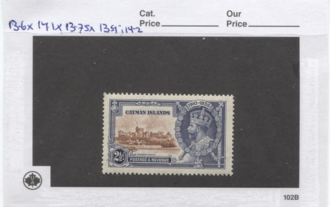
This stamp happens to have been one of the series printed by De La Rue. If you look in Gibbons or Scott, you will be told that the De La Rue printings of these stamps are perf. 13.5 x 14. There is no specification as to whether or not they are line or comb perforations.
If you have had experience collecting on a specialized level, the De La Rue stamps of other issues from this time period, you will be aware that there are often differences in the exact measurements and in line versus comb perforations.
So, one of the things that I decided to do in collecting these stamps was to take nothing for granted about the stamp's attributes. I would meticulously check every attribute and record my findings, comparing them to every other stamp in my collection to see what patterns emerge.
What I found on these stamps is differences in the perforations and almost no stamps guaging exactly 13.5 x 14. One very intriging thing, that was completely unexpected, that cropped up is what I believe may be transitional perforations. What are those? Well, they are perforations which change gauge part way along one edge of the stamp. If you have collected Niger Coast Protectorate, or very modern Canada from the 2000's you will have encountered transitional perfs. Is suspect that there are many other countries that have them also. But these are two areas that I am aware of.
On the above 102 card you can see my perforation measurements for that stamp: 13.6 x 14.1 x 13.75 x 13.9;14.2 That semicolon on the last measurement indicates a change in the guage. You will notice this when you try to take an exact measurement on an Instanta gauge, and find that no matter how you move and line up the gauge, that you cannot get a single, accurate reading. But when you get the reading as accurate as you can, note the point at which the reading veers off and re-measure from that point, you can get two different readings.
Empirically, it would appear that these variations are real, but one of the things I will have to do to corroborate them is to find examples that correspond to these same measurements from other positions. So, for instance, for that stamp with those measurements, there should be another one in the sheet that measures 13.75 x 13.9;14.2 x 13.6 x 14.1. So it is only by studying and checking lots of these stamps that I can see if there are any patterns.
I would do the same thing with the colours, the actual design details, both for the frame and the vignette, the characteristics of the paper, the watermark and even the gum.
To make the recording of information and subsequent comparison easy and organized, I've opted for a fairly expensive, but effective solution: I put the stamps, usually two to a 102 card and then record the information at the top of the card and on the back like this:

Here are my notes on the back of the above 102 card. They are two characteristics of the design that I have noted that pertain to the frame. I haven't found anything unusual on the vignette, so there are no notes about that. Nomally for that I would right "Normal vignette". I've looked at the perf and noted that on the front. I would also usually record the exact shade on the front, but I have not gotten that far yet with this stamp. I have also not yet taken a good look at the paper or the watermark, but will in time, and when I do, I can record my findings here.
Then I take those cards for one stamp and put them in an 8-pocket baseball card page like this:

This has the advantage of protecting and storing the stamps, while allowing me to see some of the varities at a glance. Then when I want to do things like compare shades, I can sort and re-order the cards, without losing my notes. Eventually of course, I will transfer those notes to an actual printed notes page. But for now this works very, very well in keeping things organized.
When it comes time to do work on the colour shades, I can take all the pages with the De La Rue blue and chestnut stamps like this one and put them all in succession. Then, just by flipping through it my eyes will be able to tell if there is a subtle, but deliberate change in the colour that makes it entirely different from what we would think of as the normal colour. I've found many of the varieties this way. I've already found some on this issue with the above stamp, which looks nothing like the normal blue colour that is usually found. Below is a side by side comparison of two of these De La Rue stamps from different colonies:
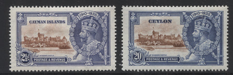
If you look closely you can see that there are very different shades of blue and the more you look at them the more you can see the differences. The difference is so distinct that it almost looks as though there are two deliberately chosen blues. Hence, another intriguing question about the stamps comes to light. If it is just a shade variation, then it follows that I should see it on at least some of the stamps printed by De La Rue for the other colonies. But if I never see it on those other stamps, then that is an indication that it is a separate colour.
This is the type of thing that would never be noticed by a collector casually collecting and mounting one set in their album. It is only by setting out to study and compare that most of us would notice these things.
So, that is my overall approach to this collection. I'm still mounting up my 102 cards onto pages. I have most all the sets up to 1958, and 1972-73 mounted, but need to do the sets from 1963 to 1966, and 1977 to date. Once those are mounted, I can continue to carry on with the study of the individual sets. I generally just pick whatever I am in the mood to work on. Some weeks it is the Silver Jubilees and other weeks, if I am feeling like looking for paper fluorescence, I will pick one of the sets from the 1960's. As I accumulate notes on the 102 cards I will eventually know which stamps are the true duplicates that I can safely trade or sell.
Next post, I will start to illustrate some of the types of varieties that I typically find as I study these stamps.
2 comments
What do I do? I am selling you
Paper suppliers. You will inevitably get into describing paper types but there must be a record of which companies supplied the paper for Crown Agents over the years. You have already indicated that the different companies in England used different amounts of recycled paper and therefore the finished paper would contain different amounts of fluorescent fibres (see “Collecting the definitives of Queen Elizabeth, 1953 to Date. Paper fluorescence and tagging”. Knowing the paper companies involved would be useful for the study of any stamps supplied by Crown Agents.