Unfortunately the standard stamp catalogues have done only a basic job of portraying the complexity of these issues, with Gibbons doing a slightly better job than Scott, but still neglecting to list many of the varieties that can be found. This is especially true of the Script CA watermarked issues that appeared between 1921 and 1937.
This issue really consists of two issues. The first, were the stamps on paper watermarked multiple crown CA, the watermark that was introduced on the Edward VII issues in 1904. This first watermark covered all the printings made between 1914 and 1927, though most values had been replaced by the Script CA watermark by 1921. The second issue was on paper watermarked multiple crown and script CA - a watermark that would remain in use until 1964.
Main Points of Interest - Paper Colour, Dies and Shades
Undoubtedly, the main attraction of this set are the shade differences that can be found on every value in the set, as well as the different colours of paper that can be found on the 3d, 4d, 1/- and 2/6d to one pound values. These colour differences for the papers can be found on both the front and the back of the stamp, with several combinations being possible, and with some of these being very scarce.
In addition to these two aspects, two different dies were used. Most all of the stamps of the first watermark are all die 1. The only stamp with this watermark to exist in die 2 is the pound, later printings of which were made in the 1920's.
We will now look briefly at these three aspects, will show you some of the differences that can be found and will discuss Gibbons's treatment of them in their catalogues. We will conclude with a brief discussion of some other aspects that you can focus on to further add depth to your collection of these issues.
Shades
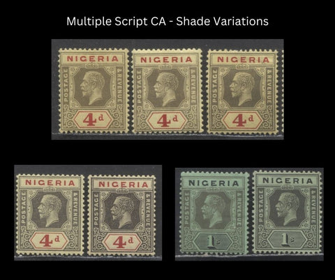
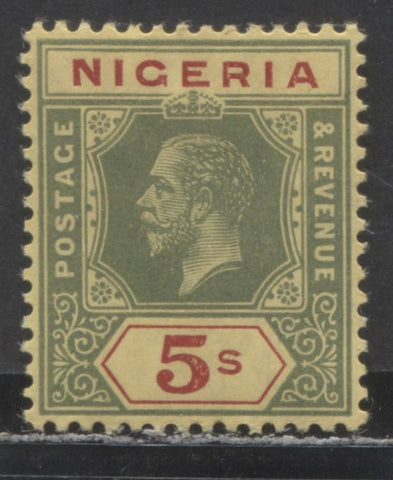
Every value of this issue can be found with several shade variations, most of which are not listed even in Gibbons. The stamps were all printed from two plates: a head plate, which printed all parts of the design except the country and the denomination. Most values, including those which appear at first to be printed in one colour can often be seen to have been printed in two colours when you compare the colours of "Nigeria" and the denomination with the rest of the design.
To give you an idea of how extensive this variation can be, consider the above picture. The two 4d and 1/- stamps shown there are covered by only a single listing for each value in both Scott and Gibbons, despite the fact that you can clearly see that every stamp is different in some way from the others. The paper colour does account for some of the difference. However, the rest is generally due to differences in shade.
Neither Gibbons nor Scott give much attention to shades on any value of either the Multiple Crown CA or Script CA issues. The only exceptions are the 1d value on the first watermark, where Gibbons and Scott distinguish between carmine and scarlet, and then the 2d grey, 2.5d ultramarine and one pound purple on red, where Gibbons lists a slate grey, dull blue and deep purple shade. Interestingly none of these shade variations in my opinion are the most dramatic.
Below I will discuss the colours used by the issue and will comment on the general range of variation that can be found:
- 1/2d green - on the first watermark there is less variation in tone, with most early printings being pure green. Some later printings in deeper green can be found, as can many pale ones. Considerably more variation is to be found on the Script CA watermark in both dies, where deep greens, Myrtle greens, bluish greens and milky greens can be found.
- 1d carmine - in addition to the basic carmine/scarlet dichotomy, there are many intermediate shades of each as well as several pure reds. This applies to both watermarks and both dies.
- 1.5d orange - the orange can vary from a pale orange to a brown orange.
- 2d grey - the grey varies from pale to deep, and can also be found in brownish, greenish and bluish undertones. Slate grey can also be found.
- 2d chestnut - some variations can be found in the amount of orange to the amount of brown in the shade, as well as to its intensity.
- 2d brown - a considerable amount of variation in the brown is found, all the way from a pale dull brown, all the way to a very dark brown.
- 2.5d ultramarine - two basic shades are the ultramarine, which varies in intensity, and dull blue, which varies in its intensity also.
- 3d purple on yellow - this is really mis-described by both Scott and Gibbons, as the colour of the duty and head plate is most often a deep purple brown. Some pale printings can be found in which the head plate is a pale dull purple. But the duty plate is almost always this purplish dhade of very deep brown. The colour is doubly fugitive, so used examples will show much more variation if they have been soaked.
- 3d violet - a plethora of shades can be found on both dies ranging from pale rose lilacs, to dull purples, brownish purple, purple and purple violet.
- 3d ultramarine - surprisingly quite a few shades of blue are to be found, as well as ultramarine.
- 4d black and red on yellow - the black varies considerably from black to grey black, deep grey, grey and pale grey. The grey can also be found to contain a brownish undertone. The red can also be found in carmine.
- 6d dull violet and red violet - the dull violet is really a dull purple most of the time, or a lilac, but it shows a very considerable range of shades. The duty plate can vary from bright purple to purple and finally to pale violet.
- 1/- black on green - the duty plate is always black, but the head plate colour can vary from black to grey black, deep grey and finally grey.
- 2/6d black and red on blue - the black shows much the same variation as the blacks on the 4d and 1/- values. The red is most often carmine, but some very striking shades in scarlet and orange red can be found on the Script CA watermark.
- 5/- green and red on yellow - the green can vary from pure green to bluish green, and deep green. The red is usually just pure red, but many printings can be found in carmine as well.
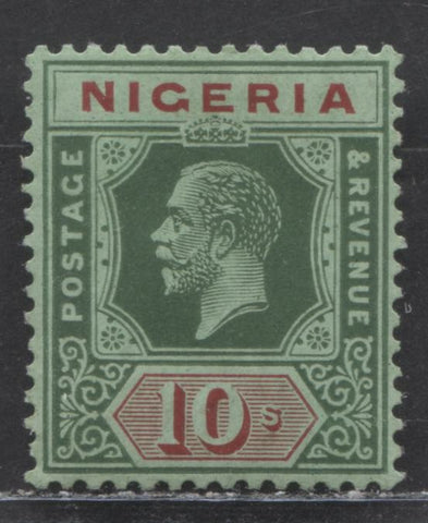
- 10/- green and red on green - the green shows the same range of variation as seen on the 5/- and the red is similar to the range found on the 2/6d.
- One Pound purple on red - the least amount of variation compared to the other values. Generally only varies in intensity, with a normal shade and a deep purple.
Coloured Papers
The next aspect adding complexity to this issue are the coloured papers used for several values in the set. Several of the papers show colour differences on both the front and back. This is the one aspect of the issue that Gibbons does pay attention to, though only for the Multiple Crown CA watermark.
There are no listed differences in the colour of the blue paper used for the 2/6d, nor the red paper used for the pound. I would agree that in most instances, the back colour of both papers is not that much different between different printings. However, there are some observable differences in the front colour of both papers, and neither Gibbons or Scott give any coverage to these.
The papers that are covered in detail by Gibbons are the yellow papers used for the 3d, 4d and 5/- values and the green papers used to print the 1/- and 10/- values.
The Yellow Papers
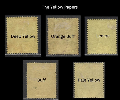
There are five variations of the yellow paper, other than the white backs, which can be distinguished from the back appearance as shown above. The key distinction that collectors often miss is the distinction between deep yellow and lemon, which is a far more common colour. Lemon, as you can see from the above, is brighter and has a greenish tinge.
Cancellations can be helpful in identification as the buff and orange-buff papers did not appear until 1920, and pale yellow until 1921. Thus any used stamps with cancellations dated prior to 1920 must either be on deep yellow or lemon paper.
The surface colours are described in Gibbons as being either yellow or deep yellow on the Multiple Crown CA printings and pale yellow on the Script CA printings. While the range is generally correct of the MCCA watermark, the script CA watermarked stamps can also be found on deep yellow, yellow and lemon surfaced papers.
The Green Papers
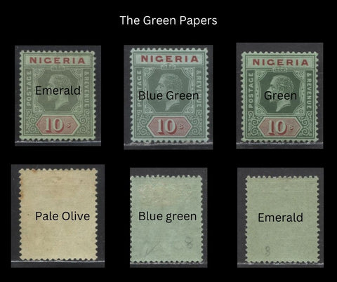
Other than the white backs there are only three back colours listed in Gibbons, and again only for the first watermark: blue green, emerald and pale olive. The blue green I find to be mis-described, as it really is a greenish blue, not being a lot different than the blue paper. The emerald is another misnomer, as it is really just a dull green. Pale olive is very easy to identify as it is neither white, nor any of the other colours.
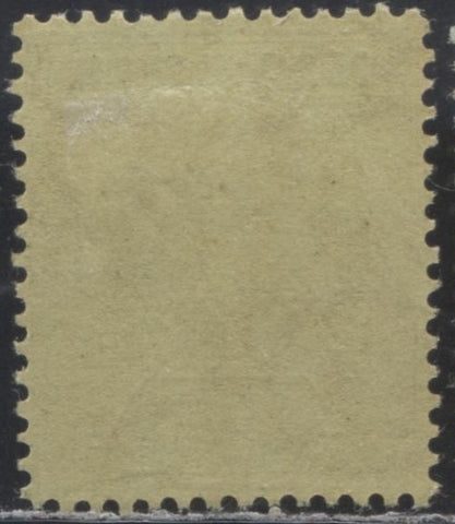
On the Script CA watermark, virtually all the stamps have an emerald appearance on the back, but with the added difference that there are visible silk fibres present in the paper, making it really a form of granite paper. In addition there exists a paper with a deep olive back that lacks the silk fibres. An example of it is shown below:
The basic distinction between the blue green, and emerald surface colour of the paper is fairly easy to separate, but you will quickly see that there are a number of intermediate shades of both types of green for the surface colouring, and none of these are listed by either Scott or Gibbons.
Dies
Two dies were used to print the stamps. On the 1/2d and 1d on some printings both dies can be found on two different panes of the same sheet, and can be collected as interpanneau gutter pairs. All of the stamps of the MCCA watermark, except one printing of the one pound are all die 1. Die 2 is the default die used for the Script CA stamps, except that die 1 is used for the very early printings before 1924, and then it reappears again after 1932.
The catalogues give several different ways to identify the difference between the two, but it is really only necessary to know one or two of them, just so that if you have a used stamp and the cancel obscures the part of the design you are trying to look at, you can look elsewhere on the stamp to make your identification.
Let's start with a side by side comparison:
Die 1 is on the left, and die 2 is on the right. For me, the two easiest things to look at are:
- The top right corner of the Postage panel: on die 1 it is squared at the end. On die 2 it curves to the right.
- The two horizontal lines that border the crown: on die 1 they have angled ends, on die 2 they have squared off ends.
The die type differences are listed in both Scott and Gibbons, though in the opposite order in terms of which stamp the catalogue considers to be the main listing and which it considers the variety. All values of the script CA watermark can be found in both dies except the 1.5d orange, 2d chestnut, 2.5d ultramarine, 3d ultramarine and the 1/- black on green.
Other Aspects that Can Be Studied
In addition to the shades and paper colours, there are other aspects that you can study to deepen your collection of these issues:
- Specimens - all values exist overprinted specimen, sometimes with two or three types of overprint. Some of the later values of the Script CA watermark exist perforated specimen also.
- Gum - on the early printings of the Script CA watermark the gum appears crackly wheras the later printings have very smooth gum. The gum on the MCCA watermark varies in colour from clear to yellowish or white, Some printings have crackly gum and others have smooth gum.
- Cancellations - hundreds of smaller village and town post offices had their own cancellations and these can be collected on all these issues.
- Booklet panes and complete booklets - though very rare, the values up to the 2d's can be found in booklet panes, as well as complete booklets.

